Screenshot / Theme-Test
-
 10-October 13
- Views 1,545
- Fans 2
- Comments 8
-
 Description
What do you guys think of this style? I'm not quite sure. I like it but I don't know how to use it for a bigger park project, since the small details are what make this style interesting I think and I can't imagine bigger buildings right now this way!
-
 Full-Size
-
2 fans
 Fans of this screenshot
-
 Tags
Tags
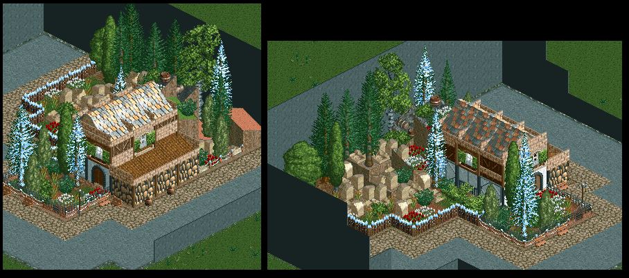
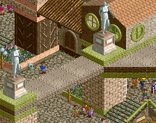
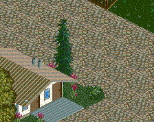
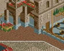
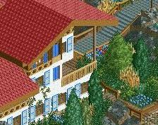
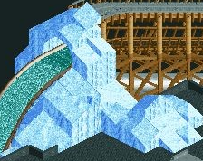
Looks really nice, but being an island in a sea of path kills the atmosphere. Try to embed this more into the landscape, or make a village in this style which leads to a coaster entrance or something. Keep it up!
Listen to Dave, he said what I feel too. Definitely develop it though, looks sweet.
Thanks guys! Yeah, I see the path-issue, it was just a test, I've got to avoid that sort of stuff when I start using it. The style is meant to be alpine or rural, so the chances of it being set in a village in the future are quite high
I agree with Dave but the rockwork is pretty good, i hope you continue
Really interesting style. Want to see more from it!
Uninspired ...
posix, could you please explain what you mean with "uninspired"? If you think it's uninspired because it's just a small abandoned section with some random path around it, I agree with you because it's just supposed to be a "sample" of the style I wanted to build in the future, so it doesn't have to be as mindblowing as a whole park
I think he means that it doesn't look like you had any realistic reference for this, or that you just put some pieces together to make some thing.