Screenshot / Quasar Queue Rework
-
 07-December 15
- Views 1,476
- Fans 0
- Comments 10
-
 Description
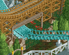
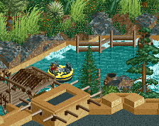
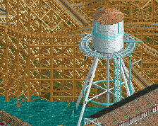
Reworked a bit of the queue, added some greens, moved the giant sign. Still not quite happy with the foliage, feels maybe a bit sparse?
Moved lift supports to change how the transfer track works (now matches IRL B&M), and changed the motifs on the station. -
 Full-Size
-
 No fans of this screenshot
-
 Tags
Tags
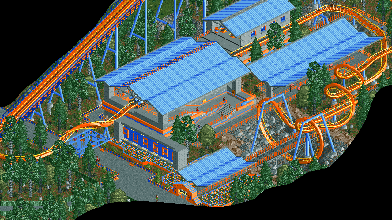



This looks much better
I agree there is too much grey. I think you should change the tree trunks back to brown, the cones that are coloured black are not helping the warmth of the screen. And make the foiliage thicker, with more tree's and bushes/srubs.
Definitely an improvement, but it can still be better. Right now this screen has 4 colors. Green, grey, orange, and blue. Definitely try to add more colors, especially to the foliage. Having different shades of green will help to make this look more realistic.
Also, G Force you officially have the best avatar out of anyone on the site now
Every tree should not be the same color. Make the birches have the lighter green leaves, and consider mixing in a couple other varieties.
Very cool. Agreed about mixing up the tree colors are just more dense trees overall.
Look at rctnw for ideas on dense trees
http://www.nedesigns...ional-speedway/
Wow, this looks incredible. Only complaint is that it feels very long... which sort of works, but I wonder if you could almost bring the whole corkscrew/batwing thing back a few blocks and have more plaza in front.
Better for sure! Nice work. For the trees, leave the birch trunks grey and the rest of the trees should be brown trunks. And varying up the shades of green on the foliage is a great suggestion.
'Liampie', on 12 Dec 2015 - 12:15 PM, said:
I'm pretty sure it ends up looking something like this
from the path.