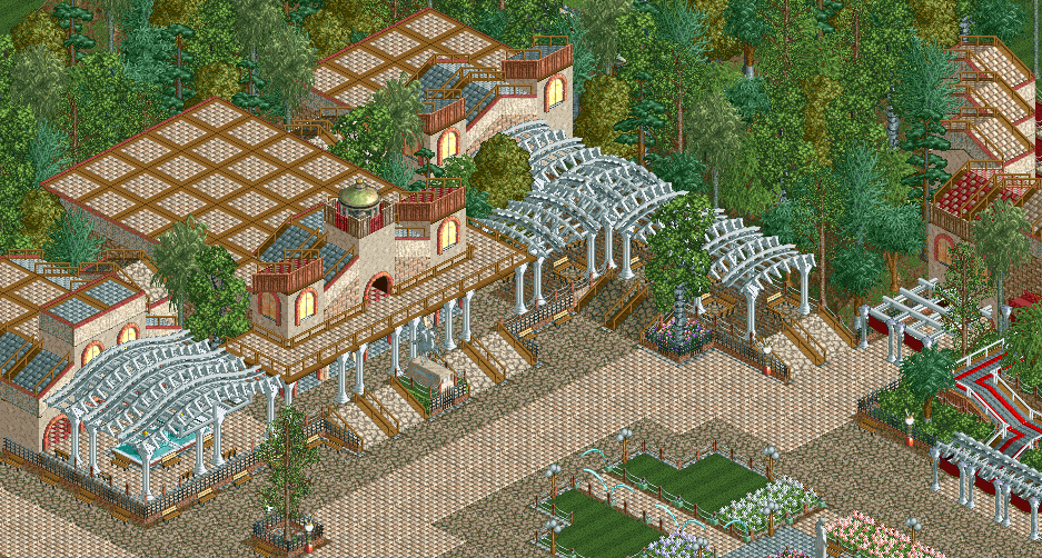
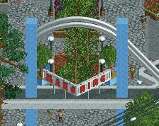
Screenshot / Town Square Exhibition Hall
-
 03-December 15
-
Untitled Disney park
-
1 of 2
- Views 3,585
- Fans 0
- Comments 24
Community Forum Software by IP.Board
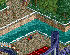
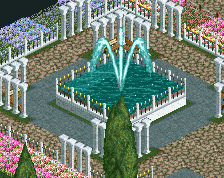
Really good start but it's pastel overkill imo. You've got the same colours in the paths, flowers, architecture and rooves. Try brown rooves or red flowers or something.
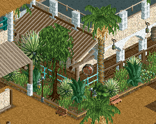
Same here, oh and nice screen too lol.
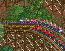
Very classic and yet very fresh at the same time. Great atmosphere, looking forward to see more!