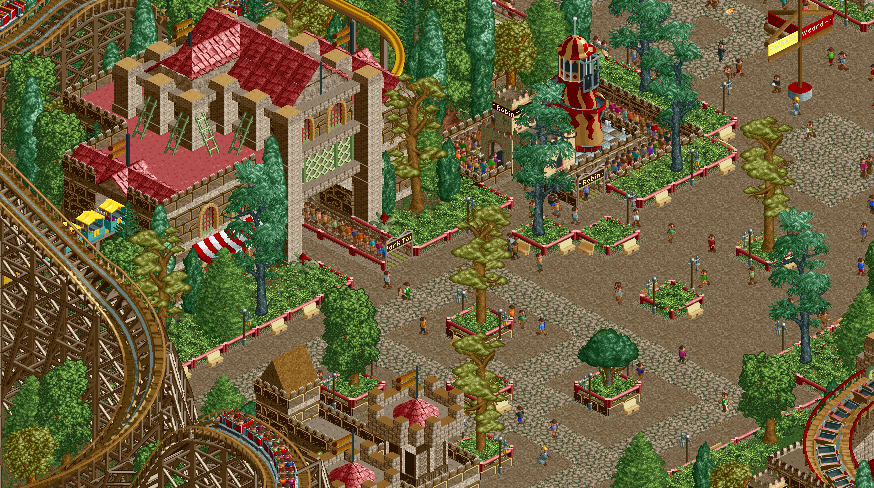
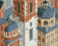
I like this different style you use. It's pretty unique. The building looks quite nice. Not sure if the red fences work. I would say they do not. The bright yellow signpost sticks out badly. And that's an endless line for a kids' slide...
I like that you're building this so fast and just having fun! Keep it going, you're getting a nice little park together. Also, Cocopa Bay is great name for your park!
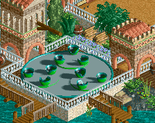
Not sure about this screen. It's cute but it misses in so many places. The tree selection highlights two of rct's worst trees. The helter-skelter has exposed castle huts and is a pretty useless ride to begin with. The stone benches are also a little distracting. I also think the woodie would look better without the lighter colored handrails.
I do, however, like that you used that different texture because it's very seldom used.
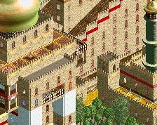
There is plenty of green in there but it still feels too brown. Perhaps because the dull red doesn't really have any power against these shades of brown.
 01-December 15
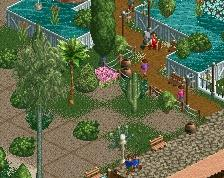
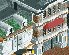
I like this different style you use. It's pretty unique. The building looks quite nice. Not sure if the red fences work. I would say they do not. The bright yellow signpost sticks out badly. And that's an endless line for a kids' slide...
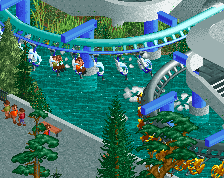
Sorry, I don't like it too much. The yellow trees are pukey.
I like that you're building this so fast and just having fun! Keep it going, you're getting a nice little park together. Also, Cocopa Bay is great name for your park!
Not sure about this screen. It's cute but it misses in so many places. The tree selection highlights two of rct's worst trees. The helter-skelter has exposed castle huts and is a pretty useless ride to begin with. The stone benches are also a little distracting. I also think the woodie would look better without the lighter colored handrails.
I do, however, like that you used that different texture because it's very seldom used.
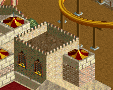
feels very Renaissance fair-y. which is fun, I always enjoyed the renaissance fair.
It's very 2007-2008 Levis to me, with a hint of Paul.
Richie Offline
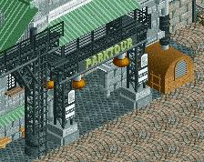
It looks very rollercoaster tycoon, which a lot of parks now do not. I like it, its interesting and obvious you are enjoying the game.
There is plenty of green in there but it still feels too brown. Perhaps because the dull red doesn't really have any power against these shades of brown.
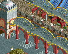
Very RCT-Guidesque feeling, i think its a good screen, beside the textures on the station, they fit not very good to the game graphic.
Tall trees.....
Otherwise really quite charming.
All the quirky textures are quite refreshing. I like how under decorated the slide is, it really gives the screen great breathing room.
I really like this. The trees, the browns, the red fences. And especially that castle wall texture on the monorail station! It's way underappreciated.