Screenshot / NCSO Attempt
-
 26-November 15
-
 SCBB's Giant Dipper
-
 1 of 2
- Views 2,688
- Fans 0
- Comments 14
-
 Description
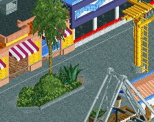
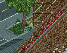
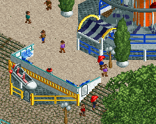
With Shogo's NCSO deathmatch thread I started an attempted NCSO recreation of Giant Dipper at Santa Cruz Beach Boardwalk.
It's not too great, but it was an interesting experiment nonetheless. Shouldn't take too long to finish, depends how many of the surrounding rides/landscape I end up deciding to include. Pictured is the children's area + log flume. Too far along to move everything further away from the map edge so the entire flume layout could be included unfortunately. -
 Full-Size
-
 No fans of this screenshot
-
 Tags
Tags
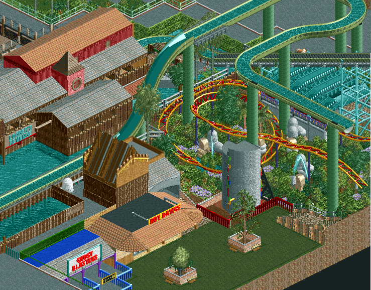
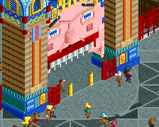
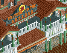
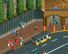
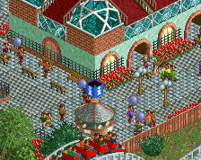
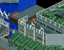
I like the flume in combination with the junior. Looks very vibrant, but the other half of the screen feels a bit death. The green path does not work here. And what's with the two trees on one tile? Not sure about the climbing wall. There must be objects to scatter the handles a bit more. Interested to see Giant Dipper.
I do think that only one half of the screen is good and the other isn't. The bottom-left half is really basic and not very imposing. The landscaping there with the paths and roofs at different heights looks great though, but the architecture can definitely be improved.
BigB Offline
^
where?
Those coloured things on the grey half-circle are western fences, otherwise there were no objects that looked custom to me
Did I miss something?
h2h8 ncso only team
Not bad at all, Stoksy. Looking forward to seeing your finished product.
^ yes, yes, and a thousand times yes.
Yeah, its kinda boring. Good to see you try it at least.
I like the mini coaster bit the architecture needs work for sure.
The right half is a lot better than the left half, architecture is just to simple on the left side. Maybe change the green path as well, kind of blends with everything else in the screen.
I like it. The whole going off the map thing is just a big no no for me but whatever.
I'm having a big of trouble discerning what level everything is at, on the left, though that might just be because of the angle. Really like the wild foliage under the mini - shame it's not operational Would be really nice to see a little train meandering through all that.
Instantly recognized this!
Love SCBB and would love to see you complete this!
Looks great
Welcome aboard the NCSO ship, Stoksy.
I like what I see, but as others have said the buildings on the left could use some care.