Screenshot / Tell Turnaround
-
 23-November 15
-
 Erlebnispark Liefenthal
-
 1 of 4
- Views 2,063
- Fans 2
- Comments 13
-
 Description
Obvioulsy still WIP, I'm pondering whether to add a small building or lighthouse on the hill behind the high banked turn. Still not awfully talented when it comes to lanscaping, this is my first attempted at using these ruined blocks, in this case as wave breakers.
-
 Full-Size
-
2 fans
 Fans of this screenshot
-
 Tags
Tags
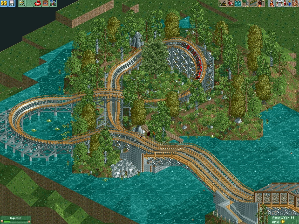
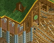
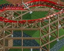
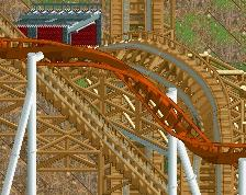
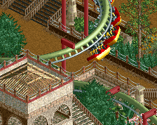
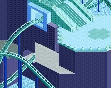
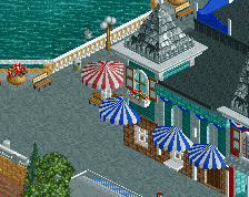
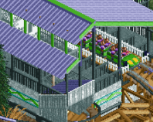
I think a lighthouse with the typical red and white stripes could look nice, you have a lot of cool colors in there now a red would really bring the screen together. Not a fan of the grey 1k ruins ether, the normal brown you're using for the backstage paths almost always looks better in my opinion on 1k ruins. Looks really nice otherwise, really gives off that awesome GG woodie feel.
Apart from the unfinished parts of the screen this is very, very good.
Really like the custom supports. Foliage is excellent.
I think you should go for a lighthouse.
Seriously, good job.
I hope it looks better now. Actually, this thing is supposed to be a S&S Hybrid. Not too many of those out there, and whilst the first half looks more like something from GG, the second half is very similar to Hellcat (a real S&S hybrid). But thanks for the feedback. I hope I can keep up the quality,architecture and landscaping are really hard to do for me.
Looks fantastic now, the brown ruins really help the screen in my opinion. Nice work.
Wow changing the ruins to brown completely changed things for the better. I would suggest trying to clean up the foliage a bit. Try clumping underbrush together underneath stands of trees while leaving bits of open space in other areas. Oh and change the trunks of the willow trees to light brown instead of this dark shade you've currently got going.
Really nice. Landscaping is quite pyramid-y though, especially underwater. Not really a problem where you've got lots of foliage but consider having some flat land at the shoreline with grasses/shrubs/rocks and also making the water shallower. +1 vote for lighthouse.
Gray ruin rocks are to G Force what steel roofs are to me, haha.
Looks good earthsass!
Well, I suppose you cannot cater to every pet peeve.
Lighthouse added. I'll probably clean up the foliage at some later point, but I actually like it as it is right now. But spreading it all over the park would be a pain in the ass, so we will see. BTW, how many spots does the misc objects tab have? I'll probably need to add more landscaping objects soon.
Love this...
Not sure about the grey supports though. I don't like grey supports on woodies.
Like I said, its an S&S hybrid. I've been toying with the idea of custom-supporting the entire thing, but I am not sure if it would look better. Or how many new objects I'd have to parkdat in. We'll see.
I honestly think it is perfect the way it is. I don't see the need to clutter this island with a lighthouse or any other structure. Sort of like Megafobia at Oakwood, just a simple coaster over a field full of sheep.
Well, to be fair, this park is supposed to be set in Switzerland, and anybody with basic geographic knowledge will know that Switzerland is a landlocked country. We have some big lakes, but I am not sure if any of them would be in need of a lighthouse. That being said, it looks nice, adds some color and gives a purpose to the path. For now I'll keep it, but I can remove it any time I want.