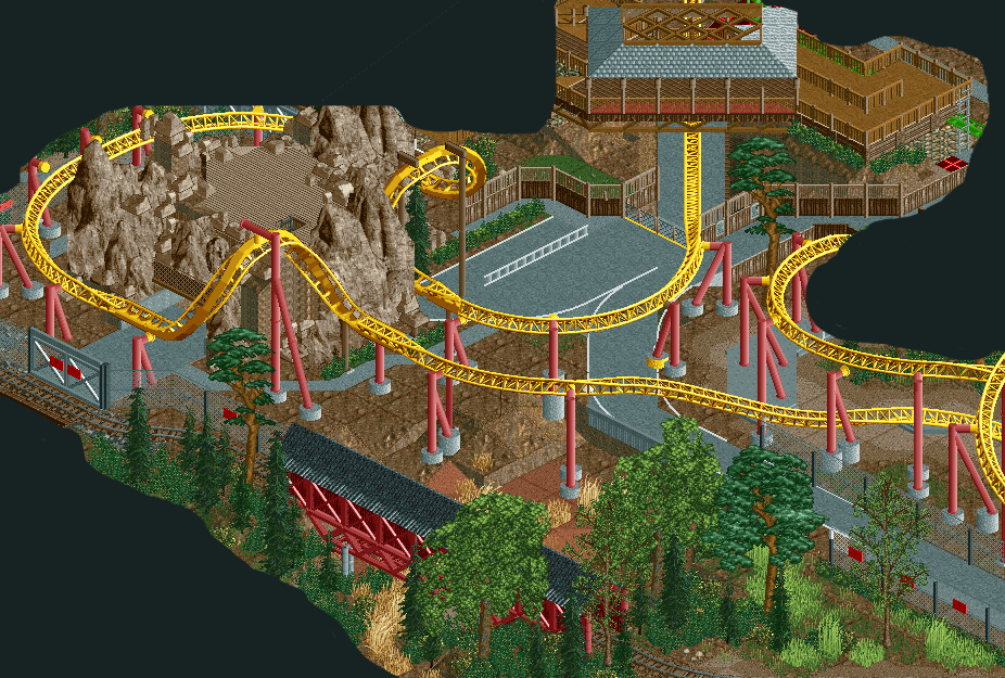
I still dont think the access and backstage roads are necessary, if you look at Maverick, there is nothing but a few dirt paths in the footprint. The roads just look super ugly and there are so many supports on that they are basically pointless. I'd much rather see actual theming like those awesome rocks you have or just grass and trees, something other than the ugly ass roads.
Also, the support you have on the 2nd cork is ugly, maybe try and emulate the ones in the pic Austin posted by shortening them and using a 90deg connection to the track rather than a 180deg connection.
Other than that the supports look great, so do the rocks and layout. Just get rid of all the unnecessary ugly stuff, it doesn't really add to the realism just makes it worse.
Some of the supports are not connected with the track. That should be possible to fix. Also not liking the yellow ends of the supports. I would just make them the same red color as the rest of the support.
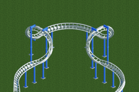
I agree about the corkscrew element looking awkward. I guess there's not another way to create it in RCT, but it does not look aesthetically pleasing. Maybe barrel rolls look better.
I'm not sure on what proposition I am regarding all the backstage infrastructure. It seems a bit pointless and isn't executed perfectly, but it does make the screen some what more interesting by adding these interactions. I was wondering what the white rail on the tarmac is supposed to be?
The upper and the lower parts of the screen look fantastic and I'm definitely interested to see more of this.
I like that you've shown consideration for backstage access, but this seems like its brought too far to the foreground. COasters like Goliath where it was built on top of existing roadways is one thing and goes a long way of telling the story of the ride. In this case the ride seems that this was all built at the same time. I can't imagine any park would spend the money on mountain facades just to stick an access road in the middle of it. Make it brown tarmac perhaps.
I am not a huge fan of the screen. Imo the backstage area dominates the whole screen. The corkscrew element is not that bad, i guess a better translation into the game is not possible.
 22-November 15


Nice
I'm not a big fan of that corkscrew element.
Other than that this looks really nice.
The diagonal track under the queue(?) looks amazing.
Darn, I want to see more.
Why not put 450 in game years into this park in the next 5 weeks and just get er done?
Corkscrew element is weird, but I like weird. Good stuff! Is it supposed to be only dirt below or is there more foliage coming?
^My thoughts exactly.
I still dont think the access and backstage roads are necessary, if you look at Maverick, there is nothing but a few dirt paths in the footprint. The roads just look super ugly and there are so many supports on that they are basically pointless. I'd much rather see actual theming like those awesome rocks you have or just grass and trees, something other than the ugly ass roads.
Also, the support you have on the 2nd cork is ugly, maybe try and emulate the ones in the pic Austin posted by shortening them and using a 90deg connection to the track rather than a 180deg connection.
Other than that the supports look great, so do the rocks and layout. Just get rid of all the unnecessary ugly stuff, it doesn't really add to the realism just makes it worse.
seems too much like desperado imo
I think G Force hit the nail on the head.
Some of the supports are not connected with the track. That should be possible to fix. Also not liking the yellow ends of the supports. I would just make them the same red color as the rest of the support.
I agree about the corkscrew element looking awkward. I guess there's not another way to create it in RCT, but it does not look aesthetically pleasing. Maybe barrel rolls look better.
I'm not sure on what proposition I am regarding all the backstage infrastructure. It seems a bit pointless and isn't executed perfectly, but it does make the screen some what more interesting by adding these interactions. I was wondering what the white rail on the tarmac is supposed to be?
The upper and the lower parts of the screen look fantastic and I'm definitely interested to see more of this.
Not into that element I'm afraid.. turn looks too bloated. The backstage stuff is pretty cool if you've got a good reason for it.
edit: maybe try it like this if you're going for something like Austins pic:
I like that you've shown consideration for backstage access, but this seems like its brought too far to the foreground. COasters like Goliath where it was built on top of existing roadways is one thing and goes a long way of telling the story of the ride. In this case the ride seems that this was all built at the same time. I can't imagine any park would spend the money on mountain facades just to stick an access road in the middle of it. Make it brown tarmac perhaps.
I think that element is ugly in the photo and in the screen. I'm pretty meh on this screen, it doesn't seem like there's a whole lot going on here
You need to paint one footer to full gray, but other then that it looks nice! Agree on the backstage arrea, it looks messy.
I am not a huge fan of the screen. Imo the backstage area dominates the whole screen. The corkscrew element is not that bad, i guess a better translation into the game is not possible.
I really like alex' take on the element, actually. Maybe you could implement that one.
as someone who loves ugly rct, parking lot coasters etc. i love this.
its so ugly, its pretty.