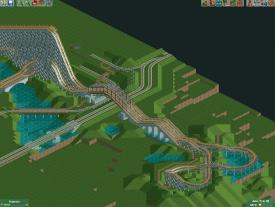
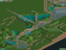
nice start though, Ravine Flyer II is really cool so I'd love to see this done legit. Definitely needs a lot more landscaping though, that thing is very terrain-y in real life.
Like I said, the bridge is only a placeholder, as I am still missing some objects to recreate the original. The only thing I borrow from RF II is the bridge, this was the full original layout, (heavily inspired by this: http://rcdb.com/2588.htm)
So yeah, not much terrain. The Vekoma Mine/Corkscrew will be full on terrain though.
Alright, I need some feedback: I've been working on these two train bridges (the smaller one belongs to the parks railway network). So, what do you think about the diagonal bridge? I am not too sure about it. Been thinking about replaing it with one that looks like the bigger bridge. Also, with the bigger bridge, the version with the support structore on top, or without it? And should I use the curved middle footing or the triangular?
I like the smaller diagonal bridge, don't make it look like the other one, I think the difference in bridges works well to give the train tracks their own seperate identities and show that one is a ride, and the other is meant for a real train carrying lots of weight.
As for the trusses on the big bridge, I really like the idea and I think you should definitely do it, I just don't like the execution. You should make the bit on the ends of the support structure on an angle. That's a terrible explanation of what I mean, just google train bridge and you'll see what I mean. If you go that route then you'll have to use the small deco pieces to create it, which I think is good because making the entire supports out of those instead of using the wooden looking supports you have now will really make the bridge pop and take it from meh to something really great. Oh, and definitely go with the triangular footing.
Thanks. I actually tried to adapt what you said before you posted it. I could do it, but I would probably need to parkdat some new objects into the game (and I am already running low on spots).
Alright, I need some more feedback. Layout A Or B? I would of course adjust the island in layout B.
A
B
Been thinking about doing some more extensive custom supporting on some of the rides turns. Maybe even full custom if I feel like it. What do you think?
A... but consider adding a flat section or two at the top and bottom of those hills. Right now they're just zig zags rather than smooth hills. Try and lose some of the tiny bumps in the turnaround too
OK, I adjusted it. looks really better, but what bothers me is that the straight piece on top of the bridge messes up the flow. Doesn't make it possible for me to place the double train tracks in the middle either.
Maybe you could try leaving an empty tile between the 2 train tracks while it goes under the coaster? The latest screen is a huge improvement by the way
nice start though, Ravine Flyer II is really cool so I'd love to see this done legit. Definitely needs a lot more landscaping though, that thing is very terrain-y in real life.
Like I said, the bridge is only a placeholder, as I am still missing some objects to recreate the original. The only thing I borrow from RF II is the bridge, this was the full original layout, (heavily inspired by this: http://rcdb.com/2588.htm)
So yeah, not much terrain. The Vekoma Mine/Corkscrew will be full on terrain though.
Alright, I need some feedback: I've been working on these two train bridges (the smaller one belongs to the parks railway network). So, what do you think about the diagonal bridge? I am not too sure about it. Been thinking about replaing it with one that looks like the bigger bridge. Also, with the bigger bridge, the version with the support structore on top, or without it? And should I use the curved middle footing or the triangular?
I like the smaller diagonal bridge, don't make it look like the other one, I think the difference in bridges works well to give the train tracks their own seperate identities and show that one is a ride, and the other is meant for a real train carrying lots of weight.
As for the trusses on the big bridge, I really like the idea and I think you should definitely do it, I just don't like the execution. You should make the bit on the ends of the support structure on an angle. That's a terrible explanation of what I mean, just google train bridge and you'll see what I mean. If you go that route then you'll have to use the small deco pieces to create it, which I think is good because making the entire supports out of those instead of using the wooden looking supports you have now will really make the bridge pop and take it from meh to something really great. Oh, and definitely go with the triangular footing.
Thanks. I actually tried to adapt what you said before you posted it. I could do it, but I would probably need to parkdat some new objects into the game (and I am already running low on spots).
Alright, I need some more feedback. Layout A Or B? I would of course adjust the island in layout B.
A
B
Been thinking about doing some more extensive custom supporting on some of the rides turns. Maybe even full custom if I feel like it. What do you think?
A... but consider adding a flat section or two at the top and bottom of those hills. Right now they're just zig zags rather than smooth hills. Try and lose some of the tiny bumps in the turnaround too
OK, I adjusted it. looks really better, but what bothers me is that the straight piece on top of the bridge messes up the flow. Doesn't make it possible for me to place the double train tracks in the middle either.
Maybe you could try leaving an empty tile between the 2 train tracks while it goes under the coaster? The latest screen is a huge improvement by the way
Nah, it would look odd and adding two pieces on the hill would look bad as well. I'll toy around with something and post it later.