Screenshot / Prowler, Rue Le Cups & Wizzer
-
 02-November 15
-
 Westwinds
-

 10 of 12
- Views 2,485
- Fans 3
- Comments 17
-
 Description
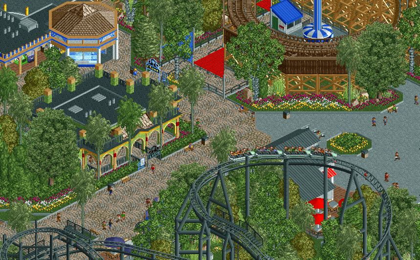
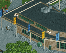
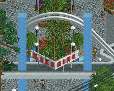
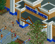
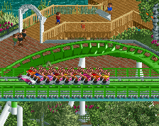
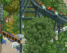
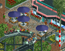
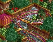
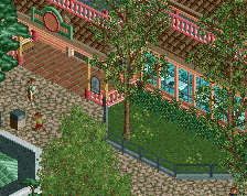
Haven't posted a screen in almost a month, so here's part of the new area around the new GCI. There will be one more screen for the park which will hopefully be posted in the next 2-3 weeks.
Nearing 100% completion, as is probably evident in the streams. Basically just foliage, fixing up some areas and waiting for objects and black hole fixes. But anyways, here is a list of things left to do (mostly for myself):
-Entrance area improvements/finishing
-Invert foliage and queue
-Rapids water elements
-Flume foliage
-Backstage foliage and detail work
-Parking lot lamps and detail work
-GCI and Rapids foliage
-Lake foliage
-Stage/Amphitheater show
-Lamps in the whole park
-Naming -
 Full-Size
-
3 fans
 Fans of this screenshot
-
 Tags
Tags
Sg.
Ssg
Can't wait to check this out.
very good. the little thumbnail is really colorful and so much fun, makes me itchy to play actually! I've got 3 weeks until exams are over...
Why is everyone posting "sg"?
Awesome... Just awesome. No other remarks from me.
Very good use of colors. Actually this is one of my most anticipated parks.
needs lamps
Thanks everyone!
Glad! Hopefully you finish up some of those projects you showed us on the stream Sunday Night!
Because they are assholes, Glad you like it!.
Happy to hear this, hopefully the release lives up to your expectations.
I see what you mean Liam, the default supports aren't exactly the most appealing things in the world. Not really sure what I can do there, but I'll see if I can add something to make it a little more interesting.
Don't worry, they will be added.
This looks awesome. I like the way the foliage goes from structured around the edges to complete wilderness towards the centre. The way the Wizzer coaster towers over the trees below is cool too. One query though: are the path tiles under the bin and bottom left, near the palm tree, meant to be crazy pathing or the custom path as per the rest of the road? (I really am just nit-picking here for the sake of it)
This park is gonna go hard for spotlight.
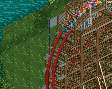
This is amazing but some of those supports on Whizzer are extending way too high above the track. I know it can't be perfect but that seems to be a little over-the-top.
I added some crazy path to the cena path just to vary it up a bit, big areas of cena path looks weird to me. Hopefully it isn't to distracting though.
The supports look fine literally except from that angle and when the trains travel on them, I'll hopefully have some objects to hide the supports on the diagonal bits, but there really isn't much I can do about them when the trains go on them. The track is just so flat and thin that there is really no good solution when it comes to toon supports. Glad you like the rest!