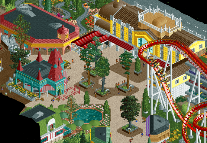
Screenshot / Entrance Plaza
-
 30-October 15
-
Urban European Adventures with Faas
-
7 of 18
- Views 2,522
- Fans 4
- Comments 16
Community Forum Software by IP.Board


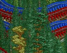

I think I'm in love
It's beautiful.
They are so distracting I didn't even notice them when looking at the screen...
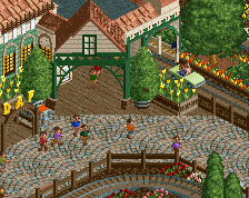
I agree with G force about the path, I think its too pale for the bright colors you're using. I completely disagree about the rocks, making them brown would look awful.
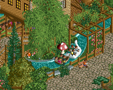
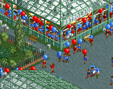
That teacups is really well done, I really like that.
I'd argue that the path is what helps make the screen. It is bright, and everything else is too, but that's what makes it so great imo.
Very lively! Love the mix of colours!
Wow, the jumping fountains is a great idea!
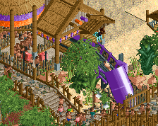
I don't know if I buy the supports from B&M's perspective but I don't really have a better solution so I think the creative license is okay here.
I love everything else. I love the idea to use jumping fountains there.
I changed this area quite a bit. Better?
Not sure about the round fences around the trees at the top, looks kinda sloppy/basic compared to the rest. But yes, this look much better, huge improvement... 4 years later lol.
I was about t say that this looks like old school Faas and I love it but then I checked the date. lol
definitely improved- I think the structures are still about 1 unit too short on each floor, and maybe textures are a bit flat. But overall fun and lively
Faas! What have you done? You ruined it!
To be fair, it's not ruined, it's still good, but it's not as unique and charming as the original screen. The atmosphere in the first screen was so much stronger, if you ask me. The buildings are great though. I wish you could've integrated them in the first screen.
Seems other people like your updated version more, but yeah, you should go with whatever you like the most.