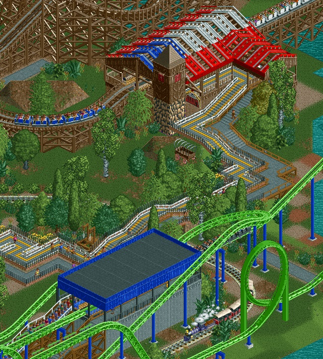
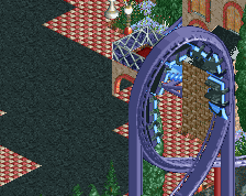
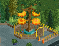
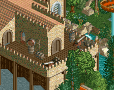
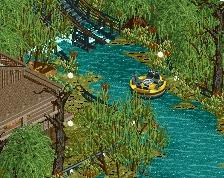
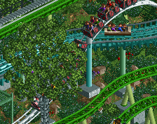
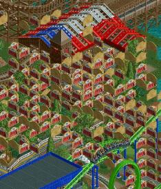
Screenshot / Trains and Coasters
-
 19-October 15
-
nin's Six Flags over Texas
-
7 of 13
- Views 2,213
- Fans 4
- Comments 18
Community Forum Software by IP.Board
Where's the "mergedbystoksy" tag?
liam probably removed it.
^
What a save!
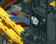
Someone should establish a religion which worship the greatness of texas giant sign.
I like the natural feel and the simple elegance of this but it's almost too plain. A bit lacking in fun/creative details compared to the other screens.
- on the station itself
- on the other station
- on the wagon
- off the wagon (i.e., everywhere)
- on the moving train
- on the other Texas Giant sign
- on my bedroom wall (why I haven't I thought of this yet)
- as a sticker on the side of the ISS
SG
I've taken your comments into consideration but it just feels like there's something missing. No idea how to fix it.
That´s perfect. Keep it exactly like that, change nothing.
"I like the natural feel and the simple elegance of this but it's almost too plain. A bit lacking in fun/creative details compared to the other screens."
yeah, exactly. glad you added more TG signs though, that certainly helps. you've got the natural sf landscape down dude.
Yeah man finally. I don't know in what universe you live, but in our earth texas is just full of natural occuring Texas Giant signs
It's really just a plain screen. There's nothing too innovative about it, nothing too risky or creative or even good-looking. It's just a good screen, not a great one, and that's it.
fuck you guys i'm here now.
love it nin, screen with improvements clearly superior though
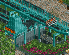
I'm afraid I think the same as RCT2day. The ~80% rating kept making me look again for something I'd missed, but I have to agree that it's rather basic. Nice work on the foliage, and the odd sculptures (wagon, gallows etc) fit in well, but I think there's plenty more that can be done with the Shock Wave station. Is this style representative of the Six Flags brand? If so, then I understand your design decisions.
Very beautifully composed. The architecture is quite simple though.