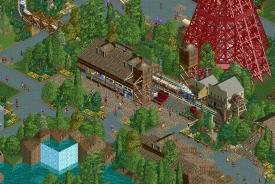
I agree with MCI, the foliage block on the left does not look good at all. Actually not a fan of the foliage in this area at all. Why not use dessert foliage? Cacti with sand or something. Would look better and could add a lot of atmosphere. Nice to see this going, though. Like Cocoa said, the simplistic buildings work really really well here.
I'll reconsider the foliage. This area is pretty weird as its a mix of styles, some dating from 2010 (the foliage block) when I started the park, and some done as recently as last night. I'm currently making my way through the park and updating everything, hoping to finish it by the end of the year. We'll see how that goes.
Edit: Steve, there's one hanging above the train on the right.
Really nice western town setting, but I also am confused by the neat section of foliage. Would really like to see this area expanded, but I do like the way everything just kind of blends in it as it is, as though this small section is a step back in time and the park didn't want to change that.
Not quite desert-y enough I don't think, as Sulakke mentioned I do think that some 'not-so-green' foliage would help the western feel. Just a little too much greenery and tarmac I think. The foliage does look a lot more natural though which I like a lot.
I really like this, especially the stuff just after the train station- its really well put together for how simple it is!
Looking great! Not a big fan of the foliage on the left, but the rest looks really good. Love the use of the otherwise ugly gates on the station roof.
I agree with MCI, the foliage block on the left does not look good at all. Actually not a fan of the foliage in this area at all. Why not use dessert foliage? Cacti with sand or something. Would look better and could add a lot of atmosphere. Nice to see this going, though. Like Cocoa said, the simplistic buildings work really really well here.
Edit: Steve, there's one hanging above the train on the right.
Really nice western town setting, but I also am confused by the neat section of foliage. Would really like to see this area expanded, but I do like the way everything just kind of blends in it as it is, as though this small section is a step back in time and the park didn't want to change that.
Yeah Kyle I know...I said "more" Texas Giant sign.
*Credit goes to my major, Austin55
Louis, we desperately need a "like" button for posts like that^
Better or worse?

Not quite desert-y enough I don't think, as Sulakke mentioned I do think that some 'not-so-green' foliage would help the western feel. Just a little too much greenery and tarmac I think. The foliage does look a lot more natural though which I like a lot.
Worse, man. This is supposed to be the WILD WILD WEST, what's with all these trees? Jim West would not approve.
The gallows were cool - bring them back! Nothing says Wild West like a public choking.