Screenshot / Starcry
-
 30-September 15
- Views 1,348
- Fans 0
- Comments 1
-
 Description
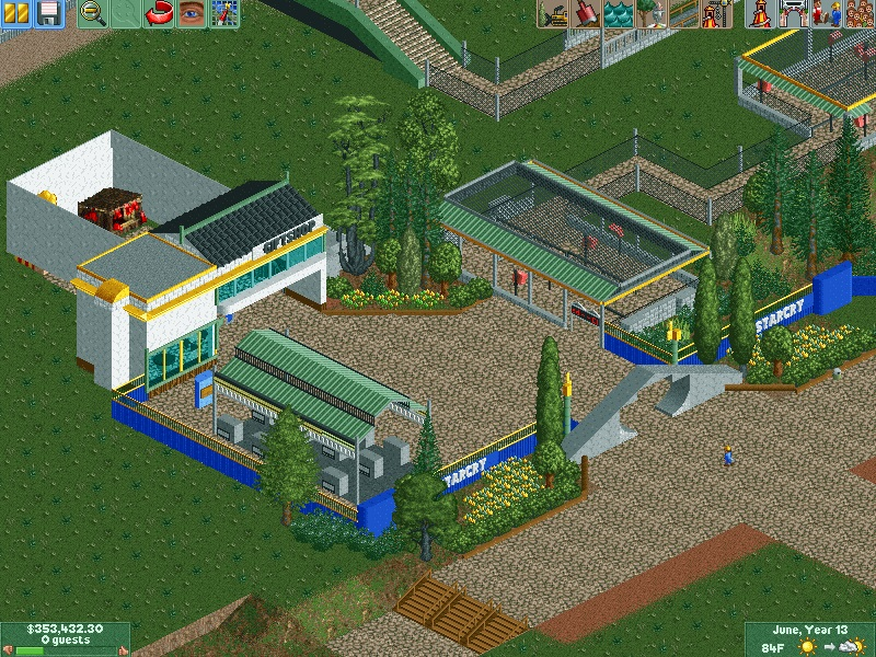
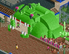
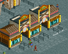
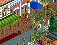
Working on a ride on my new park, I just love the layout I put for this so far. Check out the little locker area I made with a coin machine! Also the entrance to the ride looks pretty legit. I know its very incomplete but I wanted to show something lately since I RIP'd three parks.
-
 Full-Size
-
 No fans of this screenshot
-
 Tags
Tags
![screen_4731_Metal Citadel [20x20]](https://www.nedesigns.com/uploads/screens/4731/4731_thumb.png)
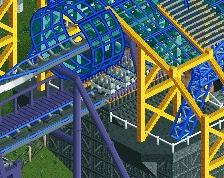
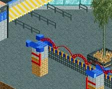
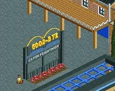
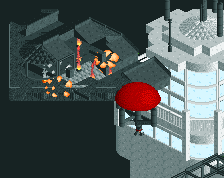
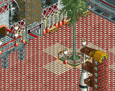


I think a bit more completion, or else blacking some areas out, would help determine what parts you wish to highlight. The netting over the queue is nice and the foliage is pleasant. The entrance arch is a neat idea, but I feel you could take it even further - really show off what the coaster (I assume) theme is with it. With all the open space, it's a bit of a shame that the ride doesn't interact with this are more. A swooping flyby or dive over the gift shop would look great and really liven up the area.