Screenshot / Goliath Sneak Peek
-
 29-September 15
-
 World Of Thrill
-

 5 of 15
- Views 1,610
- Fans 0
- Comments 11
-
 Description
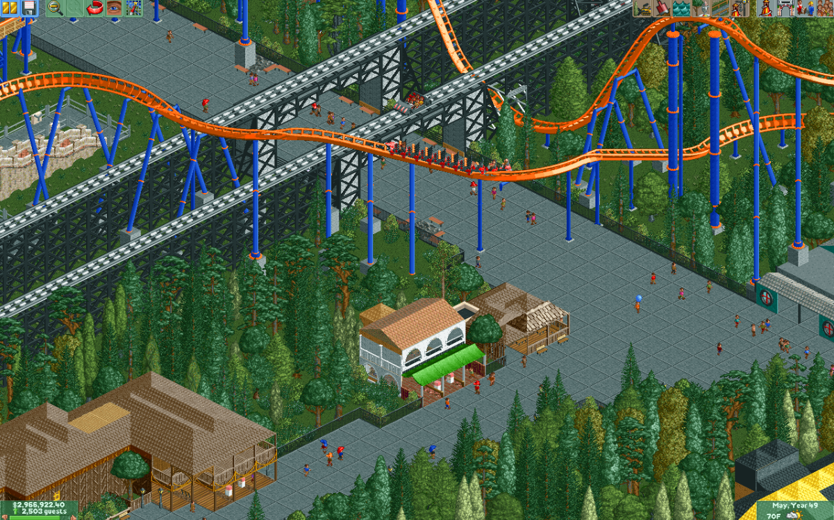
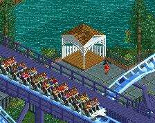
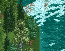
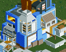
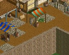
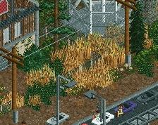
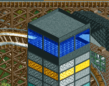
This is a mega ride, (the orange sucker), this is what got me back into making this awesome park. It wasn't originally planned in the design of the park, I just wanted to mess around and build a cool ride. But I really liked it and I got back in the addiction of this game. So enjoy this neat screen of a random part of the park!
-
 Full-Size
-
 No fans of this screenshot
-
 Tags
Tags
Did you vote your own screen 100% lol?
100 per cents bit strong!
Do you guys have any actual feedback on this?
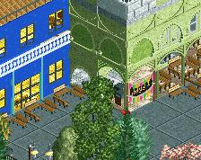
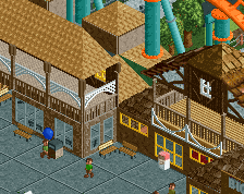
Not sure what you're expecting lol, it's not a particularly interesting area of the park. The coaster element is just a transition rather than an iconic turnaround or unique themed location, and the small white building is literally the best thing here.
Supports could be a lot better, make the flanges blue and make them more consistent. The white building is nice though, definitely an improvement.
You could break up the path with some planters or something
Expecting anything more than complete sarcastic horse shit from me will only leave you disappointed...
Despite all the content, it still looks a bit bare to me. Of course, as this seems to be a massive park with epic coasters, then in the grand scheme of things I'm sure it all fits well and has a great overall presence, but as a screen, there's not really anything eye-catching, focal or impressive (in terms of design).
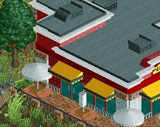
The white building is nice but the others could use some more details, if only to show what they are. The colours used, while working fine separately like the white/green combo, seem a bit erratic altogether, with some parts following a forest theme but others adding new tones for the sake of it. basically, I think it's cohesion which is lacking. It's a nice screen, but with a bit of a unified idea or theme, this area could be much better.
I can only improve, nothing I have shown so far is finished at all, just to keep that in mind. Its only a basic layout of what i want where. Ive been going to and from time to time improving small areas. The park is no-where near half done anyway lol. But thanks for the feedback!
You seem to have some nice bits of interaction with the coaters. It's just a bummer that people from the paths can't really see Goliath dip under that launched coaster because of those tall trees in front of it.