Screenshot / First Post
-
 26-September 15
- Views 2,067
- Fans 7
- Comments 12
-
 Description
First post here guys, looking for thoughts if this is too similar to Park Edda? Trying to do a Viking theme but also trying to be unique - hopefully im creating my own atmosphere here that isnt too much like Robbies.
Any thoughts would be appreciated :~) -
 Full-Size
-
7 fans
 Fans of this screenshot
-
 Tags
Tags
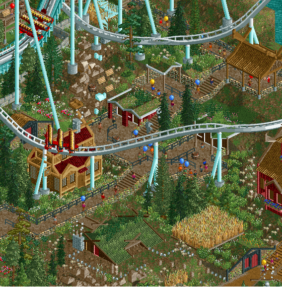
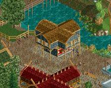
Really nice first post! A very quaint little scene from your park for sure. Lovin' the buildings that you have blended into the landscape, a style I've enjoyed employing (and am actually using on a park right now). I'm assuming the main portion of the path in this screen is the queue. If not, it should be wider, but it looks like in the right corner is a wider path, which is probably the rest of the park. Foliage is pretty good, maybe a bit too mushroomy, but at the same time your use of plants and flowers is a new style that is really nice. Keep this sweetness comin'!
great architecture and mossy town feeling. LOVE it
Brilliant stuff!
That's one of the coolest queues I've ever seen. Love those submerged buildings and shelters.
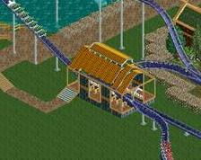
This is fantastic! You've seemed to use Edda just as a starting point for a newer look, and it's working out really well. I'm really liking the foliage in particular; it's incredibly textured and "chaotic" without being aesthetically-displeasing. The coaster colours work really well here as well. Can't wait to see more!
Nice first post dude! Really liking the feeling, only thing that threw me off a bit was the building near the bottom. Looks a bit low, maybe just add 1 block to sit on? Other than that, its flawless to me.
like the hobbit holes
This is so good
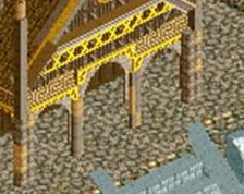
Great textures on everything, especially the house in the ground. I'm not entirely sure what the lines of grey dots/stones are though - if they're stones denoting gardens or boundaries, I think they're a bit too linear and look too artificial. Maybe replacing them with small, broken lines of plants, leaving the pathways clear, would work as an alternative?