Screenshot / Charleston Avenue
-
 13-September 15
-
 Silver Springs
-

 2 of 3
- Views 10,931
- Fans 0
- Comments 5
-
 Description
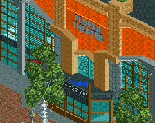
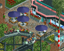
The area shown in my previous screen is part of this Main Street. I started out making an avenue based on Charleston (SC) but in the end it didn't work out that well. This result doesn't really ressemble the original avenue but still I'm satisfied with the looks. The corner building is the entrance to the Stage Company Theatre.
-
 Full-Size
-
 No fans of this screenshot
-
 Tags
Tags
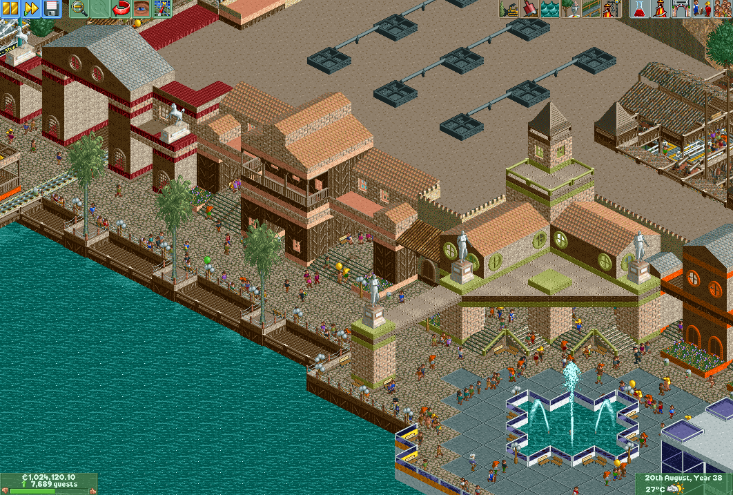
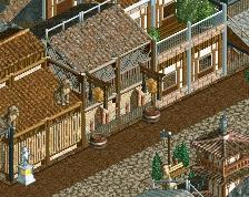
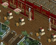
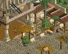
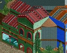
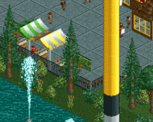
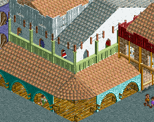
You're actually pretty great at making architectural forms. The lack of a little detail and refinement makes this feel less immersive than how it can look. I'm not saying to go for a lot, but a little helps, even in NCSO. Another thing to look out for is color cohesion, as right now expecially a lot of your trim colors and textures don't compliment adjacent buildings. A good example is the green/brown metal trims, which don't fit the theme or feel at all.
I don't like the abrupt theme change nor do I think having that much roof is anywhere near realistic.
Thanks again for the useful comment. I always find it difficult to find more detailing in NCSO, without looking overcrowded and incoherent. I used the metal trims to experiment for a little variation but I agree they might not have been the best choice for this theme. The park is almost finished so I'll try to release it soon!
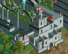
Very nice... but some asshole put a garbage can on your train tracks.
It must have been there for ages, how on earth didn't I notice. Thanks for pointing it out to me