Screenshot / Winjas Fury
-
 11-September 15
-
 Fred's Ultimate Coaster Kingdom
-

 21 of 36
- Views 2,172
- Fans 1
- Comments 13
-
 Description
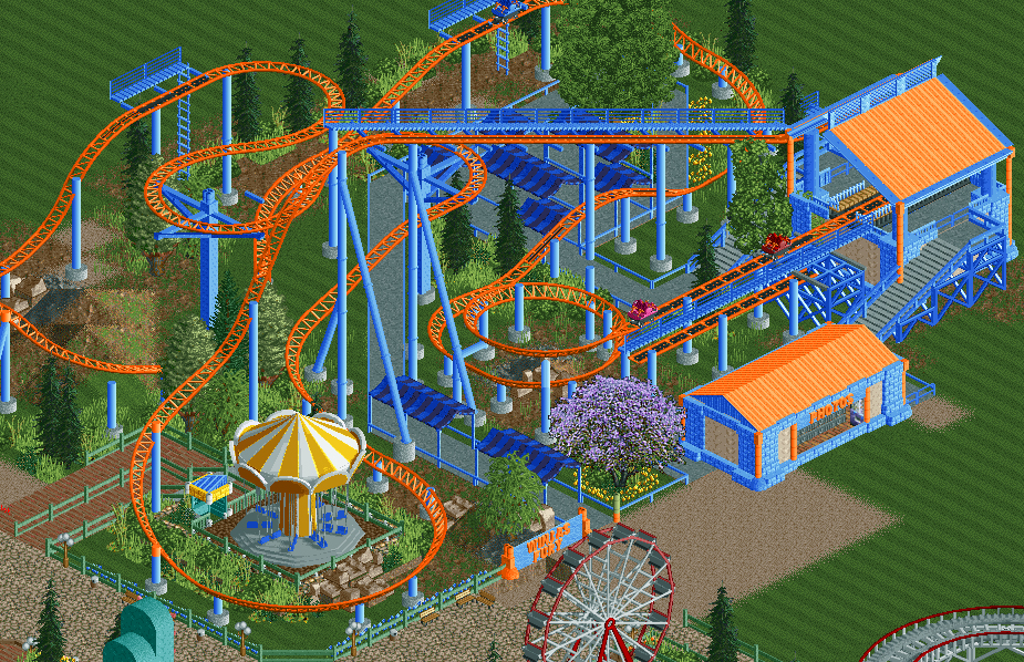
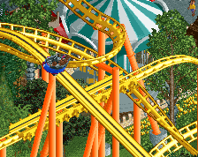
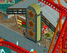
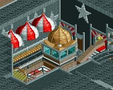
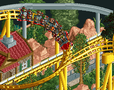
It isn't very high or fast. It doesn't look impressive, but damn, a spinning coaster is way too fun to not have in your park! Come and enjoy a dizzy ride on Winjas Fury!
Made by the best spinning coaster constructor there is to find: Maurer Sohne. -
 Full-Size
-
1 fan
 Fans of this screenshot
-
 Tags
Tags
Really good stuff! I love the interaction with the swinger.
It's a nice layout. But it feels very much Gerstlauer than Maurer Sohne.
Nice work though
I realise, but I really wanted a shout out to Maurer, under appreciated.
Then make a Maurer not a Gerst
I realised it too late It's a Gerstlauer track with Maurer cars lol
I love this, colors and interaction are perfect. queue line is golden. Best thing ive seen in a little while
Richie Offline
Went to Phantasialand and rode both winjas last week =)
Like the colour choice
The ride looks amazing, but that tree is overused. The first screen you posted had that tree, and people (including me) liked it, and now you're using it in every screen. And it doesn't always look good, as is the case here.
It's my favorite tree <3 How else can I place a purple tree and get away with it
Gotta agree with Faas on this one Fred, it looks way out of place bro.
It's my way to break the the green from the foliage, but ok I get it