Screenshot / Psycho Mouse
-
 04-September 15
-
 Westwinds
-

 6 of 12
- Views 2,911
- Fans 5
- Comments 13
-
 Description
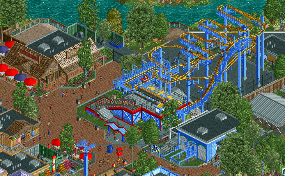
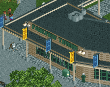
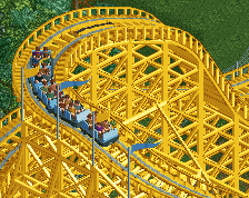
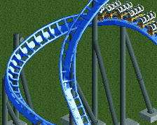
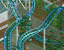
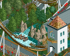
Psycho Mouse, Westwinds Arrow wild mouse added to the park in 2001. Nestled right in between the Delta Flyer station and river town themed shops. Psycho Mouse provides an attraction for the whole family, from thrill seekers to those new to Coasters.
-
 Full-Size
-
5 fans
 Fans of this screenshot
-
 Tags
Tags


Damn, you finished this already? You really build quick! Lovely screen, a lot of atmosphere.
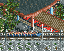
The only thing I don't like is all of the arrows. Guests should only be exiting one train at a time, always from the same place, not all across the entire station.
Agree about the arrows. Not sure I personally like the open station; at least a canvas or netting cover would help here.
The rest is excellent although I do think the paths are missing some lamps for height differentiation.
you're improving quickly man. solid realism.
I love this. Well done!
Some of the best Starpointe fan-fiction I've ever seen.
Sick!
chorkiel, on 05 Sept 2015 - 09:15 AM, said:
Hahaha, this is perfect!chorkiel, on 05 Sept 2015 - 09:15 AM, said:
Brilliant.
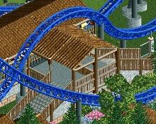
You really like that electric blue don't you? It works with the wild mouse (great support work there) but just loosen up with it on the skyride maybe? Having a more neutral color for it's station and supports would make the mouse pop even more. Agreed with others about the arrows and station cover. Keep it simple.
Architecture and atmosphere are solid, looking forward to this!
FredD, on 05 Sept 2015 - 05:39 AM, said:
Thanks, the supports really didn't take long after I figured out a system, much faster than toon supports tbh.
Ling, on 05 Sept 2015 - 05:58 AM, said:
Fixed.
Stoksy, on 05 Sept 2015 - 06:00 AM, said:
Thanks, definitely will add some lamps and lights in the future, still deciding on how I'm going to make them though.
Cocoa, on 05 Sept 2015 - 07:19 AM, said:
Louis!, on 05 Sept 2015 - 08:51 AM, said:
Wouter VL, on 05 Sept 2015 - 10:20 AM, said:
Thanks.
chorkiel, on 05 Sept 2015 - 09:15 AM, said:
Guess that's a good think? Hey, if you want to be like the best might as well build like the best.
Steve, on 05 Sept 2015 - 1:52 PM, said:
I agree on the blue, I actually realized that this corner had way to much blue and recolored some things outside the screen here. If I would change the colors of the chairlift supports they would probably be the aqua color or maybe a green. I kind of want to keep the station the colors they are currently, as its based off of the real Delta Flyers station.
Thanks though!
Stealerpittsburg Fan Offline
Awesome stuff! Full of life and details and I like the scale. Not really sure about the all-brown building on the left though. Could use an extra colour.
Great stuff!