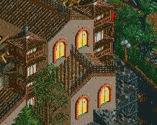
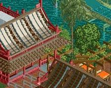
Maybe too much pink? Although at the same time it almost works, maybe try some new things out and see if it looks better. Good to see you progressing on this so quickly, it is very nicely done.
I like the pink in this section, it's not like the whole park is pink. You have a few good splashes of color, the yellow, blue and red. I think if you make the change to the flowers as Steve said, perhaps yellow, it would be a good finishing touch. You're doing some really nice work here. Looking forward to future screenshots.
Agree with walto, shades of some of the older four corners parks of artist and x250 as well I think. I do tend to think that the amount of pink/magenta is a little much so some accents of yellow, blue, and maybe white would help a lot.
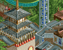
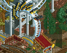
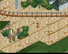
The lift is weird, but I love the rest of this. Maybe some contrasting colors would help, but I kinda like the tone it's got already. Maybe try multi d track for the catwalks instead, so it can hug the track a bit closer?
 31-August 15
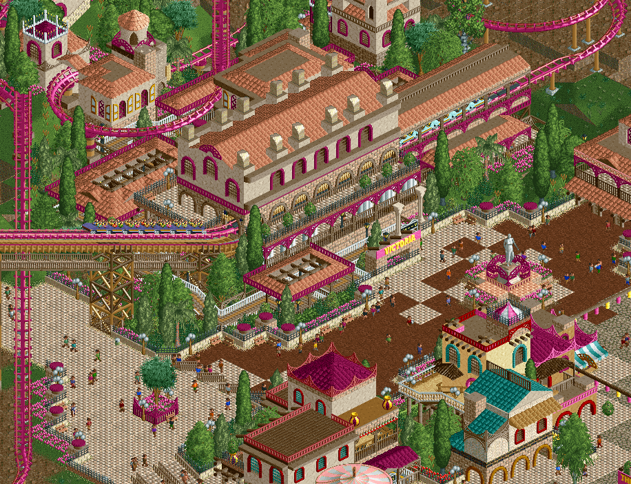
Maybe too much pink? Although at the same time it almost works, maybe try some new things out and see if it looks better. Good to see you progressing on this so quickly, it is very nicely done.
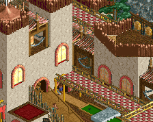
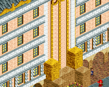
So good. Reminds me a lot of John actually. I love how busy and vibrant this is
Fantastic. My only suggestions: clean up the paths and pick a contrasting flower color. Wonderful stuff.
I like the pink in this section, it's not like the whole park is pink. You have a few good splashes of color, the yellow, blue and red. I think if you make the change to the flowers as Steve said, perhaps yellow, it would be a good finishing touch. You're doing some really nice work here. Looking forward to future screenshots.
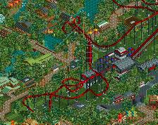
Woah, you're building this fast! Great to see.
Agree with walto, shades of some of the older four corners parks of artist and x250 as well I think. I do tend to think that the amount of pink/magenta is a little much so some accents of yellow, blue, and maybe white would help a lot.
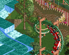
^I think it's purely because the woodie coaster is 1 unit too low. It hugs arrow track fine imo.
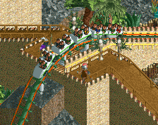
Way too much pink.
This looks great, It has a classic feel for me. I really like it. Pink is okay with me.
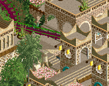
Paths look a little weird. I think the different types clash with each other. But its not a huge deal.
I really like this, but I'd for sure listen to what others have stated above. There is a bit too much pink, and so another color would help a lot.
Love it.
Ooh. I like how vibrant this is.
There are enough other colours to compliment the pink to be honest.
I love it exactly as it is. Great stuff!
oh wait i forgot to do my joke
you need to add pink rocks too
Thank you guys. I'll take your advice on board.
Sooooo much yes
I love it, don't change a thing.