Screenshot / Beemer Bumpers
-
 30-August 15
-
 Fred's Ultimate Coaster Kingdom
-

 19 of 36
- Views 2,164
- Fans 0
- Comments 17
-
 Description
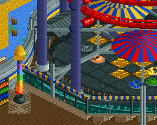
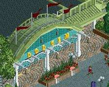
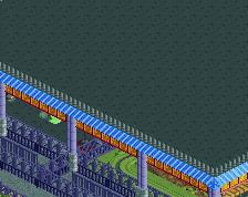
Of course riding and bumping against each other is absolutely one of the most fun things to do! Since tailgating and buming into each other is a typical feature from every BMW driver, we got some beemers so you can give them a cookie from their own dough.
-
 Full-Size
-
 No fans of this screenshot
-
 Tags
Tags
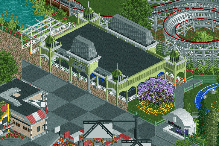
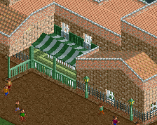
Cool building. But I think this time the tree does not look good. I'd go with a tree that is taller than the building.
I love the tree, please keep it.
What's not working here is the checkerboard paths. Stick to one tarmac or the other. Then, break up the path with planters and add the taller trees there with flowers. The atmosphere will be dripping! Try adding tall trees in front of the facade, but don't block too much of it cause it's great.
There we go with another #purpleTree discussion
Such a shame that you can see the bumper cars roof through the building... I'd just raise the ride itself a slight bit so it won't be visible.
I quite like the path though. Not too sure about the hanging canvas roof things (how exactly are those called?) though. They're nice, but i don't feel like that beam can support their weight, and thus it looks odd. I also like the tree, but the flowers around it are a bit too much. I'd just replace it with some of the dark green half bush. Other than that, i love it!
A lot of the comments here are about things already said about other screenshots! The path, purple tree and those hanging umbrella's.... All of which looks good to me.
The building itself is perfect for it's purpose, the fact you can see the roof of the ride is no biggie. I would suggest to add some quite dense foliage and trees behind the building though to separate it from the coaster.
Well that's because the tree looks good in some places, and not good in others. The fact that on one screen people decided the tree looks good, doesn't mean it looks good everywhere.
Maybe try some other colours? The green is a bit dull.
Will add more dense foliage Jappy.
I think the tree looks fine over here. With the roof of the bumper cars painted black, it isn't very noticeable anymore either. Hope that works enough, otherwise I'll just use the crooked house method.
For the building itself, I think it's perfect. Won't change a thing.
Change the bumper cars to grey, that way it looks like the grates that power the bumper cars
Lovely stuff. I like the placement of the entrance and exit paths, keeping the entire front of the building unobscured.
Me too! It looks amazing.
This is great! I'm not sure about the other buildings or the big umbrella, but the bumper cars must be the most stylish I've ever seen! Creative work with the towers from the slide. Nice colors and just about the right amount of details. Love it!
It just feels so washed out of life and atmosphere at the moment.
And any suggestions to improve that?
I like my color use, but maybe I should keep the gray path a bit more further away from the bumper cars.