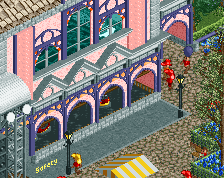
Screenshot / DJ Stage
-
 28-August 15
-
 Barefoot Park
-

 2 of 5
- Views 1,449
- Fans 0
- Comments 5
-
 Description
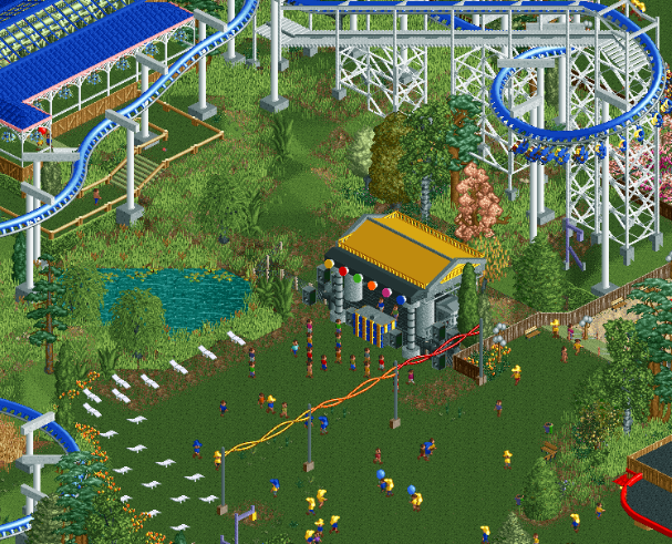
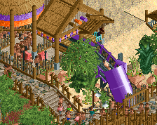
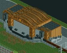
Kick off your boots and come chill with DJ Havenosocks and Afeetsee who are more than happy to press play on their macbook once in a while, while we pay them a ridiculous amount of money to do so!
Dance the day away (after all it's never night) or sit back and enjoy the music from a lounge chair. -
 Full-Size
-
 No fans of this screenshot
-
 Tags
Tags
Really cute.
Brilliantly detailed, but for a stage maybe a bit too small.
Damn, that stage is almost flawless. I do however think the contrast in size with the expanse of path outside is a little much [but that's just personal preference] and I'd like to see you change the roof to something not so textureless.
I wish you would add more color to your foliage other than just the basic green, maybe the tan and even the lighter green would give this a lot more depth and fullness.
Poke: Thanks
Jappy: You might be right. I just had this idea of spreading little stages around the park without it being overwhelming. The idea for the stage on this spot came from Luketh himself.
Stoksy: There is no path in this park. And the roof is canvas so it is supposed to be textureless. Might add the lighter yellow to give it some texture though.
G Force: You're right. It you would see a slightly bigger version of this screen, you could see some other colours of grass as well. I try not to change the foliage Luketh already put in this park too much because I really like it.