Screenshot / Flight Deck & Centurion
-
 27-August 15
-
 Westwinds
-

 5 of 12
- Views 2,249
- Fans 1
- Comments 17
-
 Description
Wanted to get a screen out to celebrate the park reaching year 200, so its not exactly the best but I still thought there was enough new stuff to make it worth showing. I still need to fix the backstage area on the right, and the very left is a little unfinished.
-
 Full-Size
-
1 fan
 Fans of this screenshot
-
 Tags
Tags
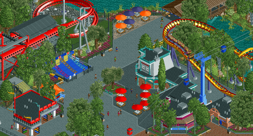
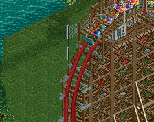
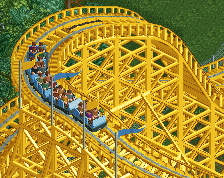
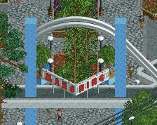
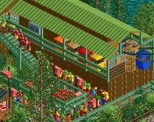
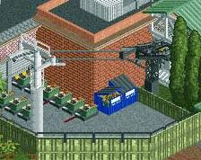
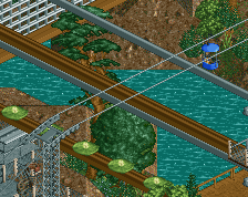
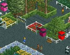
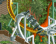
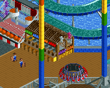
Flight Deck looking fresh af. I really like this park.
Your games are a little too big in my opinion; looks to be almost the same size as some of your actual buildings which throws the scale a bit for me.
The red coaster looks so good though; great bold colour choice.
Look fine to me they are huge for real.
This has to be my favorite project from you.
It's definitely solid but yeah what Liam said.
You're nailing this! Great job capturing the Cedar fair feel.
Gives off a really familiar vibe.
Not necessarily a bad thing because it looks good. I'm looking forward to you using these skills on something a bit more original next time.
So basically what Liampie said, haha.
I have to be honest I don't think he's copying anyone's work. He's copying Cedar Fair (specifically Great America) and since that's been done really well before it's impossible not to copy some of the RCT applications.
Other than BGA this is my most anticipated park on the site simply because I love this style.
I wasn't saying that as well. At least that's not what I intended.
Like everyone else said, really good work. At the top of the screen there's a purple footer though.
That white-roofed building is fantastic.
I honestly don't find it overly sterile. I find it slightly sterile by design because of the park it's being inspired by and I think it works perfectly. Then again I loved the overall shittiness of Soak City in the Magnum recreation because of the shitty waterpark it was inspired by and everyone else complained about it so I guess don't listen to me. lol
From a realism standpoint this is great though.
As far as sterility goes, I completely understand what everyone means. I attempt to make the park feel a little more natural, however making everything clean and organized is also something I work on. It probably won't be difficult to create a more atmospheric or natural feeling park by changing the path type or making it a little more chaotic, but that's not really what I'm going for at least for this project.
Now to address the copying/originality thing. Tim hit the nail on the head here, my style and approach has completely changed from Magnum which is probably why this park feels so much different. Magnum was built after I had essentially been away from RCT and NE for almost 5 years. I made it without much planning or expectation or really any though as to how I would approach the park. Which is why it seemed so odd and sterile in places while others were far superior. It was simply due to a change in approach as the project progressed, especially after I got picked up by the Hurricanes.
Being able to talk and get instant feedback from some of the best players to ever play the game has really changed the way I play. However, this has probably made my style feel much more like theirs in a way rather than my own. Also having more time to reacclimate myself with the NE world and new RCT "cannon" per-say that's developed since early 2010 has also had lots of influence on this park, where it didn't so much on Magnum. Personally, it doesn't bother me that this reminds people of other parks, as Cedar Fair has already been done basically perfectly before. Obviously this isn't close to perfect but I'm glad that this at least reminds people of those other parks. It also is somewhat of a testament to Cedar Fair itself, who's parks have the style of almost no style. Although Great America is a heavy mix of Marriott and Paramount as well, which probably makes this a little more difficult to pull off than a 100% Cedar Fair or Six Flags etc.. park.
Thanks Bill, Robb, Zach, Steve, and others for the comments, it really means a lot to hear positive feedback from players of your statures. Especially considering where I was 7 months or so ago when I started Magnum.
After this park I want to do something a little less conventional, maybe even with a fantasy vibe. But after playing this game on and off for over 10 years, I thought it was time to build a full park at an acceptable level, which is something I've never been able to do. Hopefully Westwinds turns out to be that park when it is finished.