Screenshot / Bavarian Park WIP
-
 23-August 15
- Views 2,146
- Fans 0
- Comments 13
-
 Description
So I'm new to NE and wanted to share the park I'm currently working on so that I could get some opinions from some more experienced players. As stated in the title, the park is supposed to have a feel like a Bavarian village. There isn't much foliage yet, but I want that to be the last thing I do. I'm more looking for opinions on the buildings right now. I want to know what suggestions you all have and what your thoughts on the layout I have are. Do my buildings feel scattered at all? How is the park flow? Should I add more variety, or keep using similar designs for each one? I know some things that I need to fix, like the merry-go-round clipping the roof of its building and the entrance to the balloon race (I didn't notice that until I began to upload the screen). So yeah, C&C are appreciated and definitely needed.
-
 Full-Size
-
 No fans of this screenshot
-
 Tags
Tags
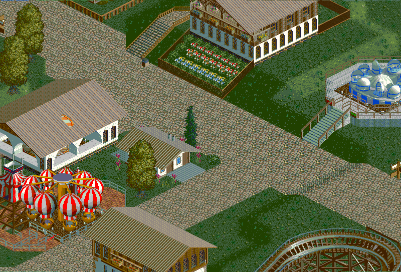
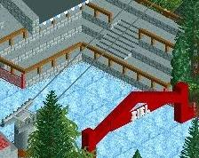
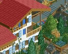
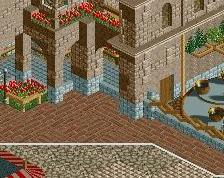
Buildings: I'd get rid of the steel roofs, try something wooden.
Park flow: Try to make the paths more curvy and organic than just cornered T-junctions.
The building on the very bottom looks pretty nice, besides the roof.
I doubt the accuracy of your archy but it works alright for what they are.
Some suggestions: use a different program for your screens. The colours look off....
What's there is pretty good. What I suggest is making the paths smaller or break them up with planters/fountains... Add benches and lights to make them more interesting since now they're just a huge mass.
Keep playing, and welcome to the site!
This is a pic of everything I have so far, so you can comment on anything you see in here too.
Also @Jappy, I have no idea what happened with the colors. I only used paint to crop it and then save it as a different file, the colors have never changed on me before doing that.
@csw: The reason I'm using the roofs that look this way is the fact that I cant find any cso that features wooden roofs with only the roof and no base block part underneath it. If someone could show me where to find something like that, I would actually like to make the roofs wood.
@Liampie I was hoping I could get a comment from you, I've been basing my work vaguely off yours . I will definitely take everything you said into account, especially the part about merging the buildings and paths.
Paint distorts the colors - I learned that the hard way. The paths are too straight and blocky, and it doesn't fit with the Bavarian theme.
I would try to vary up your walls a bit more, right now every wall on each building is the same. The top and bottom buildings look really nice, save for the steel roofs, but each wall has a window on it. Space them out and add detail in between and everything will look 500x better.
Actually, the window-heavy buildings and lack of other details are there by intention. As seen here http://m1.i.pbase.co...MucJun06528.jpg and here http://imgur.com/eFMxPHO , there are many bavarian buildings that have many windows with few details besides. Rest assured, though, I will try to focus on adding a bit more detail to the walls and take what you said into consideration.
Also just wanted to mention that you guys are being a big help, and I really appreciate you guys telling m all this. I'm looking forward to continuing to build and post more stuff here.
Ah, I never noticed that. In that case, keep on doing what you're doing. I still feel that the steel roofing should be swapped out, if that's what you're going for.
Looking at real life park maps helps greatly with park layouts. Buildings are less scattered, the path is more organic, etc. Planning out where attractions, buildings, path, etc will go helps a lot, and allows you to fix a lot of issues that you may have had later in construction.
Right now, like others have said your path is very square and the buildings and rides are very scattered and every thing feels like a single experiment rather than a cohesive park environment. The individual parts aren't bad, but nothing comes together because its so isolated.
I'll definitely take a look at some real life park layouts, thanks. I'm really getting a sense for what I should be going for, you are all a great help.
On the colors: Instead of opening the file with paint you have to go into paint and open it from there. That should not change the colors.
Okay, thank you. That's a big help!
Save as jpeg next time. It won't look discolored that way. I haven't read the other comments so forgive me if I am reiterating what others have already said. I would have the buildings spill out over the path, it will break the grid which is always good as well as making things look more like a real village and not quite as "planned."
I like the buildings a lot. They convey the look perfectly. But you do have to make them more overgrown with some heavy trees and vines growing up them.
Also since no one else touched on it, the wooden coaster should hug in a bit more I think. Shared supports IRL are cheaper, so put tracks next to each other to share common beams in between. You could also probably double the length for what you've got, but keep it in the same footprint by winding around more sections through the lattice of the existing supports. Also get rid of the helix, it doesn't do anything.