Screenshot / Centurion & Delta Flyer
-
 19-August 15
-
 Westwinds
-

 4 of 12
- Views 2,346
- Fans 2
- Comments 18
-
 Description
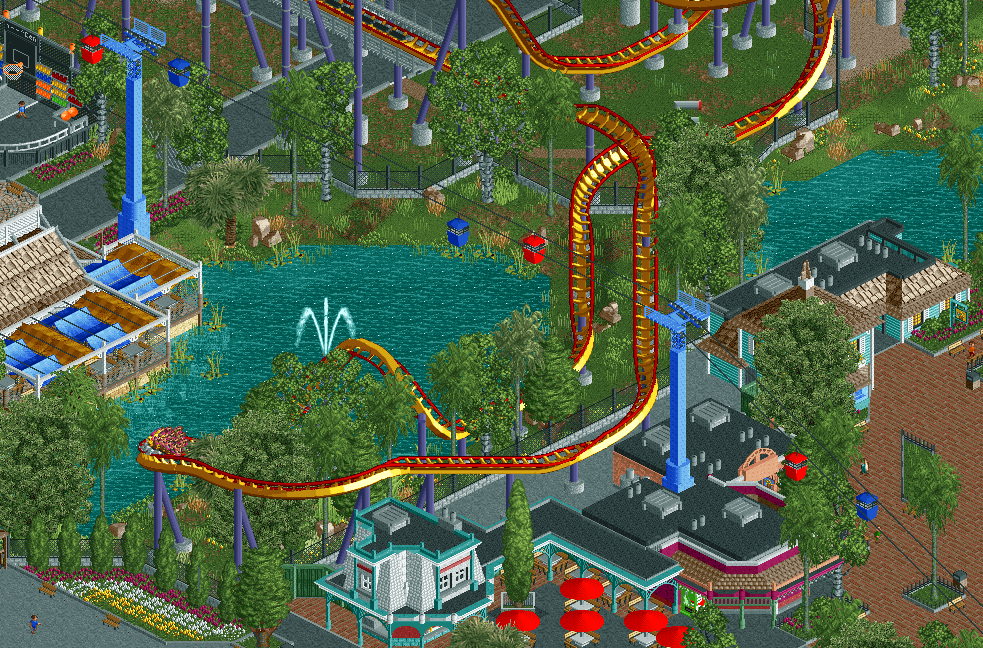
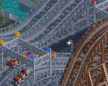
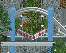
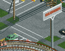
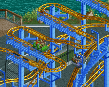
New for 2015! Centurion, Westwinds first Floorless coaster.
Much like Mantis at Westwinds sister park, Cedar Point, Centurion (formerly Vortex) underwent a conversion from a Stand-Up coaster to a Floorless coaster for the 2015 season.
Park is about 40-45% complete, aiming to have it done by the end of the year. Although, it with classes starting back up next week, I have no idea how much I will be able to work on this in the future. -
 Full-Size
-
2 fans
 Fans of this screenshot
-
 Tags
Tags


This is great, especially those buildings that nin mentioned! Really impressed with how fast you're building man, keep it up!
B&M floorless? That should be an interlocking corkscrew turnaround. Rest looks great. I love the chairlift poles.
Yea it kinda feels like there is to much foliage in places.
I don't like the idea of a coaster running through a staff area like that. It's not great for the riders to look at and it would be an enormous nuisance for the employees. Might be better to flip the current corkscrew to a left-transition instead and then have an interlocking corkscrew going back with the track up over the water instead of over the concrete.
Excellent!
I'm very much looking forward to this!
I really like this tbh. I also love that fricking basketball game in the corner. The coaster looks nice to.
Not necessarily. Plus, this is a stand up converted to floorless, so putting interlocking corkscrews would be unrealistic.
This. It's totally unusual.
Ah, missed the conversion part. I'd at least flip the corkscrew over the track, just seems too open to me.
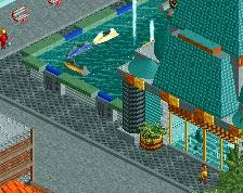
I love that café/restaurant next to the water. Good stuff.
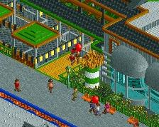
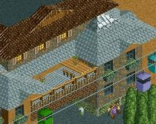
Cool stuff, you're works getting much livelier! My main issue is the buildings on the right look a bit squat. They're out of proportion with the restaurant/terrace on the other side.
Agree with all the above comments.
This is meant to be the oldest area of the park, hence all the larger trees and such. But I do see your point, especially in the more open areas.
Yea, I knew this was going to be an issue. Mostly due to bad planning on my part and not fixing it as soon as I saw the issue. Also because the people I was talking to at the time I was building this said it wasn't a big deal. Perhaps I could modify the backstage area so it doesn't interfere with the coaster too much, because I dont think I'm going to completely re-design the area just to fix an issue like this.
The layout is based off of Vortex at Great America in California, hence the simplicity and oddity. Sure its not exactly the same, but I wasn't really going to an exact recreation of the layout either.
I'll look into changing this, definitely seems a little out of scale now that you bring this up.
Thanks everyone for your comments and suggestions.
Phenomenal. H2H has made you into a great player.