Screenshot / Daimyo- Cliffs
-
 16-August 15
- Views 1,601
- Fans 0
- Comments 5
-
 Description
Hiya.
So I have had no luck with projects lately. I've started many and gotten nowhere with any. So, I went back and dug up this old project. I posted a screenshot of it a while ago, and have since then redesigned a lot of things, including the cliffside area shown here. I am still unsure whether I actually like this "style" or whether I will actually continue on this project at all.
Lemmeno. -
 Full-Size
-
 No fans of this screenshot
-
 Tags
Tags
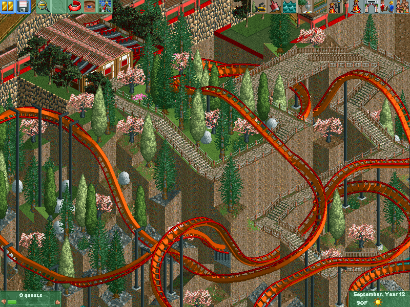
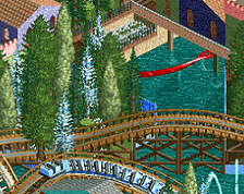
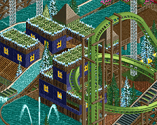
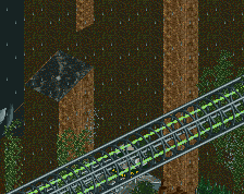
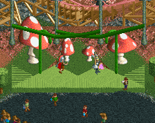
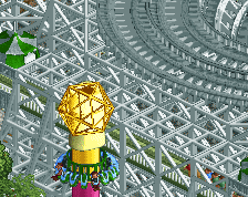
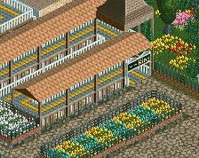
Definitely an improvement. However, I'm not a huge fan of the gumdrop rocks, they look completely out of place. Maybe try ruins instead, even though they aren't quite the right color, they would probably look a lot better. Just be sure not to over do it and it will look a lot better.
I agree with Liam. Must have taken you a lot of time so well done for that. I would get rid of the gumdrop rocks.
I agree the gumdrop rocks need to go. I didn't like how the foliage looked without them and I do like the color they provide but the objects themselves stick out badly. This is nsco, so they were the only objects I could find that even remotely simulated rocks. Any ideas for a better item to add a silvery color? Maybe just some silvery trees.
I'm not sure really where to go with the landscape next, honestly. It definitely can be improved but I haven't found a way to do that while still keeping it feel like a rugged cliff.
The layout was changed a lot and I think this one is the best so far. I'm still not completely satisfied (not to mention it's like a 12 intensity). I want it to be chaotic to a degree but there are definitely some rough edges to smooth.
Other than that, this was a blast to build and thanks to all for commenting.
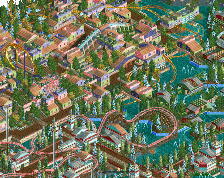
Here is a nice overview from the same angle that shows the progress of Daimyo so far and what my plans are for it at the moment. Just keep in mind that the layout is a very rough draft and the dock area is 10% finished.
Also, good time to mention that I tried the Egyptian ruins, but I don't like the color so those are a no.
Attached Thumbnails