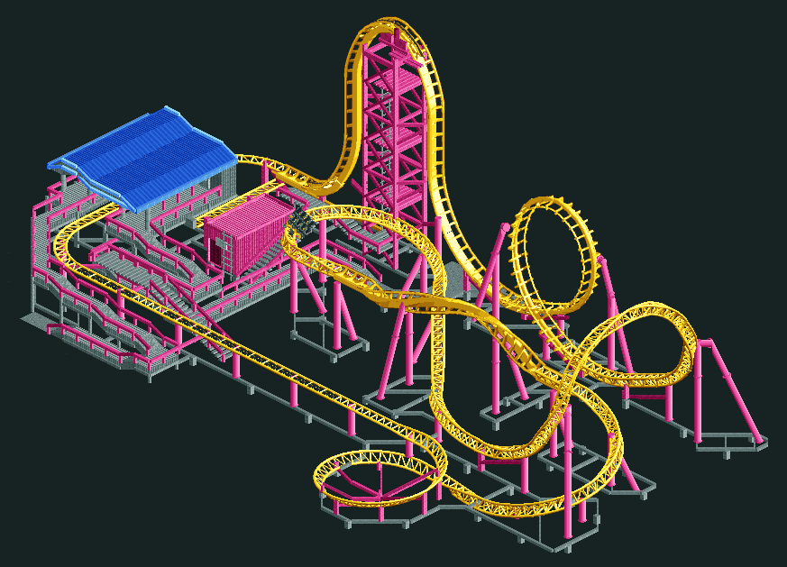
Screenshot / Louis Layout #1: Eurofighter 320+
-
 26-July 15
- Views 7,280
- Fans 4
- Comments 31
-
 Description
Based on the Eurofighter 320+ models found at Adventure Island, Canobie Lake, Duinrell & Parc Sindibad.
97* drop followed by a Vertical loop, Cutback, Inline roll & 360* Helix.
Model available for travel or park operation and comes with its own generator. -
 Full-Size
-
4 fans
 Fans of this screenshot
-
 Tags
Tags
Yeah I didn't think of the stand-up. Could of used that, not sure how much different it would have looked.
They are close in height in reality, and in game, i've placed them at the same height just cause it looks better aesthetically and flows better.
Techie-techie miniature Nazi-precision. Where's the effortlessness?
Otherwise good.
Literally no effort went into this.
Did you get my point?
this is literally better than any minimalist rct2 work that ive seen. love it louis!
this is literally better than any minimalist rct2 work that ive seen. love it louis!
To a realism-focused playstyle, effort is being forced to imagine the details instead of simply having all the pieces already present and neatly aligned.
/zen
PizzaWurscht confirmed prophet
Lol.
LMAO