Screenshot / Daimyo
-
 25-July 15
- Views 1,831
- Fans 0
- Comments 2
-
 Description
Ancient project that I may resurrect.
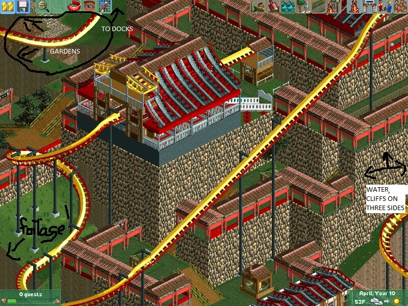
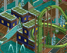
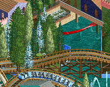
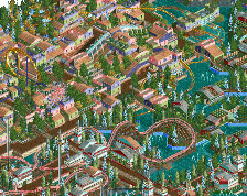
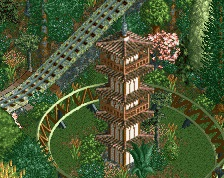
Initial idea was a Japanese mountain fortress surrounded by cliffs and ocean on three sides, and a flying coaster dangling over the cliffs.
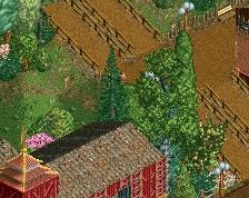
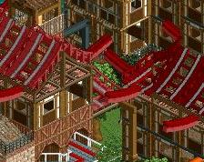
Obviously unfinished in parts, but I put them in this screenshot (along with some lovely Paint action) to show how it would be laid out. In the upper left, a cliffside garden with some lovely coaster interaction, with a small, winding path down to a dock, where the coaster's quasi-turnaround would be.
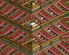
Please disregard small errors like missing roofs, walls, etc. Now that I've discovered the (in)convenience of hacking, that will all of course be fixed if I release this park.
Also please let me know what elements of this I should keep, and what I should redesign.
Thanks! -
 Full-Size
-
 No fans of this screenshot
-
 Tags
Tags
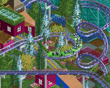
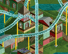
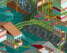
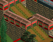
Consider seriously toning down the height differences and the flatness of the cliffs. It looks incredibly unnatural.
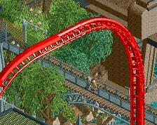
Mix in some real landscaping, maybe the rock texture. The steep incline at the top of the chain lift doesn't look good. Lastly, I suggest a different colour scheme for the coaster, something a bit darker?