Watched you build some of this on the VOD, are you restarting this?
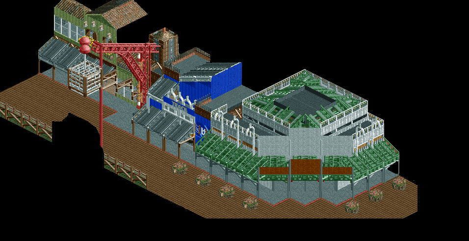
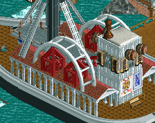
I do like what you've done with the candy canes + gravestones, they look really good. Not sure what it is but the building with the green awnings isn't quite working as well as the others. Whether that's because of the size or because it's a diagonal I'm not sure but that's my least favourite here. The lighter green building on the left and the crane are both really great though; kudos!
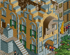
You should extend the white poles all the way up the white diagonal walls, like you did with the grey poles on the brown diagonal wall.
This looks great, amazing trackitexture and I love the cage on the crane. Maybe see if you can make the lollipops look more connected to the crane though.
I like the green building on the left since it looks clean. The other buildins look horrible imo, sorry. Looks like a huge incoherent mess of poles and pieces of track to me.
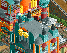
I'd agree with Faas here. The blue building looks like you're trying too hard to make non-square buildings, while the green awning building looks like you're trying too hard to diagonal.
It says a lot that the best looking part of the screen is the simplest.
I knew that the white building was a little messy due to the diagonals, bit I never expected to hear anything on the blue one lol
the blue one just doesn't make sense. what is it? its got some slopey one-way roofs and some flat bits and stuff. It just doesn't look like a real building IMO
Cocoa I was trying to emulate a couple of buildings on Pacific Wharf at DCA. If I put a slightly taller building next to it, it would flow and look sensible
But this does't look like actual buildings. All the trackitecture and random scenery pieces makes it look like a bunch of track and scenery pieces, and not like buildings. I don't want to be harsh but I think that's the (my) problem with most of your (NCSO) work. I like the building on the left the most because it's the one that looks like an actual building the most.
Uh, i'd honestly go as far as saying that even that half-finished NCSO screen i recently posted has more structure in it than this. Not saying this doesn't show skill, you're still the best at NCSO building and there's some awesome stuff going on here. It took me some time to find out what the curved object wall in the blue building was made out of, it looks really nice. The crane is brilliant too.
But i have to agree with Faas, i can't make out what's going on with the buildings themselves. If i were you i'd replace the blue one with a more symmetrical one and keep the curved pole thing in. It looks random right now and without the randomness it would be way better.
EDIT: no one here is saying that the roofs look bad, they're just super weirdly placed. Why is there a roof sticking out some other direction in the middle of the blue building? What is going on there?
 15-July 15


Watched you build some of this on the VOD, are you restarting this?
I do like what you've done with the candy canes + gravestones, they look really good. Not sure what it is but the building with the green awnings isn't quite working as well as the others. Whether that's because of the size or because it's a diagonal I'm not sure but that's my least favourite here. The lighter green building on the left and the crane are both really great though; kudos!
You should extend the white poles all the way up the white diagonal walls, like you did with the grey poles on the brown diagonal wall.
This looks great, amazing trackitexture and I love the cage on the crane. Maybe see if you can make the lollipops look more connected to the crane though.
I'd agree with Faas here. The blue building looks like you're trying too hard to make non-square buildings, while the green awning building looks like you're trying too hard to diagonal.
It says a lot that the best looking part of the screen is the simplest.
I'm also with faas. the mess destroys what lovely wharf atmosphere you should have
I like this a lot but the path is not ncso.
Looks like shit.
I don't care for the large green building but I like the rest... then again I love track roofs.
the blue one just doesn't make sense. what is it? its got some slopey one-way roofs and some flat bits and stuff. It just doesn't look like a real building IMO
But this does't look like actual buildings. All the trackitecture and random scenery pieces makes it look like a bunch of track and scenery pieces, and not like buildings. I don't want to be harsh but I think that's the (my) problem with most of your (NCSO) work. I like the building on the left the most because it's the one that looks like an actual building the most.
None of the scenery usage here is random; it's all purposeful. The canes and the tombstones are supposed to represent lights
Uh, i'd honestly go as far as saying that even that half-finished NCSO screen i recently posted has more structure in it than this. Not saying this doesn't show skill, you're still the best at NCSO building and there's some awesome stuff going on here. It took me some time to find out what the curved object wall in the blue building was made out of, it looks really nice. The crane is brilliant too.
But i have to agree with Faas, i can't make out what's going on with the buildings themselves. If i were you i'd replace the blue one with a more symmetrical one and keep the curved pole thing in. It looks random right now and without the randomness it would be way better.
EDIT: no one here is saying that the roofs look bad, they're just super weirdly placed. Why is there a roof sticking out some other direction in the middle of the blue building? What is going on there?
http://www.disney-pa...wharf_cafe1.gif.
I have these sloped industrial l looking rooves next to a flat surface
I'm going to defend the blue building, I can see what he was going for, and I see a lot of buildings like that irl.
What I don't like is almost everything on the corner building. The diagonals, and the upper roof both look super ugly.