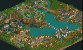
Hard to say Poke... Here's an overview:
So the map's nearly full but it's gonna take me a long time to go back through everything tidying it up and getting everything to the same quality and looking cohesive.
While I find this incredibly skilled work I feel like it's lacking the harmony you've shown in the other areas of the park. I'm trying to put my finger on it. I'm leaning towards your foliage being the issue there. It's very well done, but you have a very clean and streamlined look going on through this whole area and your foliage is very lush and sporadic. Use more lines of flowers and more "man-made" foliage. I'm not saying ditch the lush foliage you have completely but maybe some more focused direction with it will really make this shine. Lovely stuff.
Those domes are sick.
It's so lush and clean! I love it!
Holy shnikeys where did this come from!? I love it!
Phenomenal
You're totally my favorite builder right now. Lovely stuff.
Very Evergreen Gardens.
Pretty much perfect.
i have never seen anything like this screen. very original
This is so good. How close is this to being finished?
Thanks guys!

Hard to say Poke... Here's an overview:
So the map's nearly full but it's gonna take me a long time to go back through everything tidying it up and getting everything to the same quality and looking cohesive.
very nice ll park with nice hacks and very creative ideas