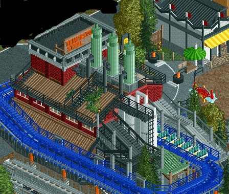
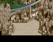
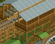
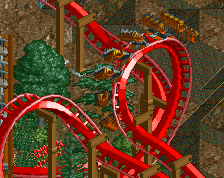
Screenshot / first verxion of tempesto's station
-
 02-July 15
-
Baker Lake Amusement Park
-
22 of 28
- Views 2,513
- Fans 0
- Comments 17
Community Forum Software by IP.Board
How are you dealing with the object limit?
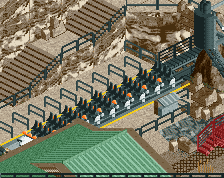
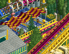
It's nice I guess, maybe a bit too busy but I like it. Shit though, just finish this Coupon.
Too busy and too many colours.
Very nice screen. I agree with turbin3 though. I'd try changing the orange on the tempest sign and the blue of the track. The blue is kind of hurtful for the eyes atm.
too blue of a track I rec but everything else is sick
I think the colours are fine.
I agree to busy.
Any suggestions on how to fix it then?
I'm not really sure what the theme is?
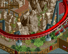
Why do all the roofs have to be lined with catwalks? It'd be cleaner if you left some rooftops untainted.
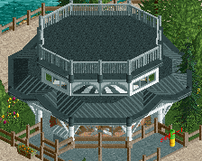
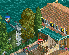
I actually love it. has a great atmosphere, and certainly more interesting than some of your other work
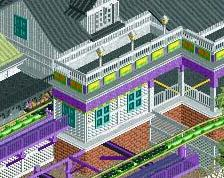
Do my eyes deceive me?
college is really bogging me down atm.. it'll be finished during my thanksgiving break hopefully