your image editor fucked up the picture so its hard to appreciate the atmosphere
its a tad messy, i'm not sure I like the grey track/black supports. sort of boring. but a good start, you're pretty good so I'm sure you'll work it out
ooh thats nice. the bigger screen gives more context and it looks like its composed way better than I thought. nice work
you can color anything whatever you want! whats grey got to do with a minotaur anyway?
I don't think I'm sold on the lava-ground rooves though. I think it takes away from the more formal greek style. I'd try sand or wooden rooves (even try with wooden coaster track and then you can experiment with different colors, I know ancient crete stuff did use a lot of colors)
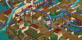
Really nice layering with the overhangs, mazes and rides. Try to avoid one off theme elements like the bobsled track, if it's used once try to find a couple more spots for it and if it doesn't look good in several spots, get rid of it. The purple does look good on the coaster.
Not a fan of the brown/tan path, but the construction is very good.
Spot on. Ancient Crete.
Is the coaster name Earthquake? or Minotaur?
your image editor fucked up the picture so its hard to appreciate the atmosphere
its a tad messy, i'm not sure I like the grey track/black supports. sort of boring. but a good start, you're pretty good so I'm sure you'll work it out
It's good, but yeah maybe the coaster colours need changing?
I really like this. The colors are a bit boring, sure, but I don't really have a problem with them. I really like the changes in elevation.
Wonderful. Extremely complicated composition but it works very well. The colours are refreshing and unique. I'd keep them the way they are.
ok I'm quite liking purple:

but can I still call a purple coaster 'Minotaur'? Is that allowed?
ooh thats nice. the bigger screen gives more context and it looks like its composed way better than I thought. nice work
you can color anything whatever you want! whats grey got to do with a minotaur anyway?
I don't think I'm sold on the lava-ground rooves though. I think it takes away from the more formal greek style. I'd try sand or wooden rooves (even try with wooden coaster track and then you can experiment with different colors, I know ancient crete stuff did use a lot of colors)
Really nice layering with the overhangs, mazes and rides. Try to avoid one off theme elements like the bobsled track, if it's used once try to find a couple more spots for it and if it doesn't look good in several spots, get rid of it. The purple does look good on the coaster.
its ll but i think its to mutch and overloaded but its always good