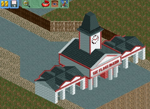
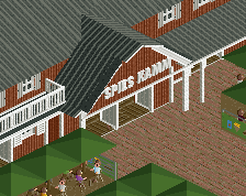
Screenshot / Six Flags Idaho Entrance
-
 18-May 15
-
 Six Flags Idaho (Finished)
-

 3 of 6
- Views 2,388
- Fans 0
- Comments 19
-
 Description
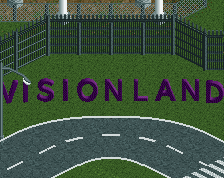
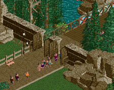
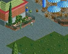
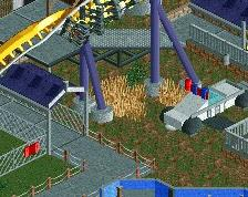
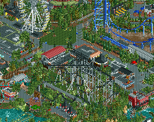
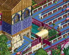
So here's an update from my park. I transformed it from a design submission into a park. Problem is, that now I have to do a lot of things that I wasn't sure I could pull off. First thing was an entrance. As you see, I didn't do a bad job with that one. Second was an oldschool wooden coaster, which isn't a catastrophy. Third was a mainstreet, which turned out to be a huge problem. I have literally no idea how to do it properly. I don't know how to scale correctly, how to detail the building, how to build the lower level of a building and so on. I just have problems converting something I see into something in the game, wheather it's about architecture, foliage or park layouts. I guess I will keep trying but my hopes aren't really high right now.
-
 Full-Size
-
 No fans of this screenshot
-
 Tags
Tags
thats good. everybody has his own style. keep building at this project. we all want to see a hole park from you.
go on ! ^^
also you are free to ask everything and everybody for styles, layouts and buildings...
This is not bad, this is solid work. One of the best things ive seen from you. But it needs a bit more details. Some wall corner pieces and stuff like that would do wonders here imo. And maybe the clock tower is a bit to high. I would also suggest break up the path a little bit with flowers, grass etc.
The only tip i can give you is just to go on because you can only learn from practicing. And when you have really no idea how to do something dont waste your time on trying it, just go on with another part of the park and come back later. If you think you really never will get a good mainstreet for this park done, you can always ask me to help you or give you suggestions because i have some ideas in my mind how you could do it.
So just go on and always look for feedback! Nice to see youre improving!
I know what style my mainstreet should be like. I just have no idea of anything else. I often think that a lot of you guys just have a picture in their head on in their pc that you want to build. I never have a picture in my head and I'm rarely able to convert something from real life into the game. I'm seriously thinking about making a timelapse video to show you, how trapped I am if it goes to buildings.
make a stream or something like that. you have this problem so long. you have other pictures talking about this problem. You also told that on RCT2Germany and in the streams. we should help you^^ . rct2 is about art and having fun, do that. just go on!
Hmm!....I would like to see where you may take this!
Six flags idaho would be what would happen if six flags bought Silverwood and expanded over the airport behind it.
idaho udaho
For real though good start. One thing I'd do is add things like small planters with flowers and perhaps some trees. This will make the path more interesting. Then toss on some benches and lamps on the paths.
Just follow a standard 'x' height for every floor. Generally scaling is about 5 units per floor as that allows for a nice height differential which also permits detailing.
Planters are quite important; breaks up path and also allows for a more scenic area for seating/lamps.
I wish it was easier to explain how people build stuff; look at a picture, use objects to recreate said picture as best as possible. But, maybe it's a little more complicated than that.
Yeah, building try number 5 still looks like shit
[attachment=20436:Sucks.jpg]
That's actually pretty good.
everybody has his own style. i`ve got my pizzawurscht theming.
build and go on!
First house I build for the mainstreet that I don't want to delete
[attachment=20439:Mainstreethouse.jpg]
Another improvement, good path interaction and form.
Looks great, version1.
One unit too low on that balcony in my opinion, still; great to see you improving!