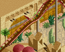
it was inspired by that place, I worked there for 2years so I can pretty much build that place from memory,and nothing says steampunk like a zeppelin coming from a hall like that, I plan on adding a lot more machinery in places but this will probably end up being the main style, the more dark reds and toned down copper colours to bring it more to life and give it some pop in places...
This is awesome, could end up being your best work if you get the colours right. I think you should pick either softer colours like the pale red you used or brighter, shinier colours like the track's red. They don't always go well together.
As good as the building looks, I still maintain that the green/gold/teal/grey would look better for the steampunk theme. Not saying that the red is inherently 'bad' just that there are nicer options in my opinion.
Still, love the form and everything that's going on; just personal preference regarding colour from my perspective.
I still think the colors don't work! the red for the track clashes terribly with the iron/rust red of building. the structure is incredible, fantastic work (shouldn't you be doing, like h2h stuff though?)
 16-May 15
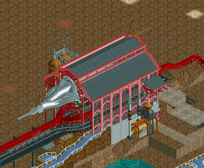
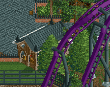
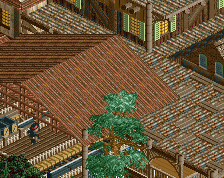
Reminds me of Antwerpen Centraal! Love the way you constructed the boiler, and that airship is very impressive!
it was inspired by that place, I worked there for 2years so I can pretty much build that place from memory,and nothing says steampunk like a zeppelin coming from a hall like that, I plan on adding a lot more machinery in places but this will probably end up being the main style, the more dark reds and toned down copper colours to bring it more to life and give it some pop in places...
I don't think the colors are an issue. I would play around with a different color for the coaster maybe, make it pop.
Otherwise, this is amazing. BG wonderful in a refreshing style.
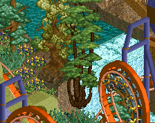
Fuck yeah I LOVE Steam punk. May I suggest brown supports
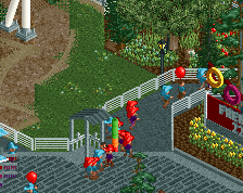
Best Station 2k15
Its almost perfect, the colors are a little iffy, but man this is great.
As good as the building looks, I still maintain that the green/gold/teal/grey would look better for the steampunk theme. Not saying that the red is inherently 'bad' just that there are nicer options in my opinion.
Still, love the form and everything that's going on; just personal preference regarding colour from my perspective.
Looks awesome, I'd change the color of the coaster too as FK suggested.
I still think the colors don't work! the red for the track clashes terribly with the iron/rust red of building. the structure is incredible, fantastic work (shouldn't you be doing, like h2h stuff though?)
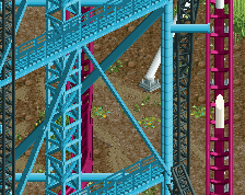
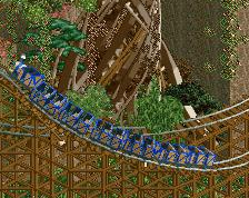
Not bad. Again too forceful for me. You'll have to cram in that level of detail everywhere around this to uphold any kind of balance.
if he keeps this level of density up, and i do believe BG is very much so skilled enough to do, this will look incredible.
that being said, excellent theming my man.
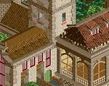
I love everything about this screen, but I don't know what that giant grey thing under the roof of the station??
^ Airship/zeppelin