Screenshot / Twisty Turns - Old Project
-
 09-May 15
- Views 1,820
- Fans 0
- Comments 6
-
 Description
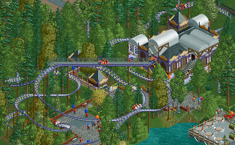
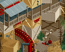
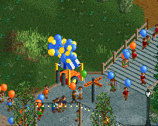
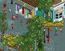
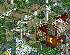
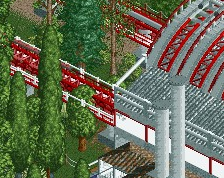
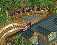
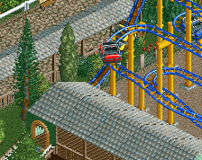
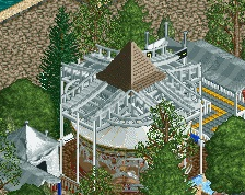
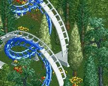
Screenshot from a park I won't be finishing, and uploading. It's pretty much finished, but there's still quite a lot of work to do. Nonetheless, some area's are pretty good, like this one. I think I will be re-using the design from this station in my current project though.
-
 Full-Size
-
 No fans of this screenshot
-
 Tags
Tags
Amazing!
I agree, your station has some nice elements to it, but I'd do some revamping of it. Though I'm sure you were thinking of ways to improve it anyway. I don't really like the white metal portions with the rest of it, and then with castle style windows are way out of place.
Dinosaurs Offline
Love the liveliness of this screen. I'd add something to the wooden fences to make them a bit higher.
way back in the day of scenario play, I always thought the mini cars was the best looking ride around. I still feel a little bit that the aesthetics just work really well on this type of coaster, good combo of speed and twistiness or something. just a bit of nostalgia I guess.
you don't really see this coaster type around much, I guess its a little ambiguous as to its real life counterpart?