Nice to have a new poster. Looks pretty good thus far. Try working in some color to it. Western can have red buildings, some foliage, maybe changing the color of the windows, shades etc.
western buildings can be white, gray, peach, tan, brown, red, dull purple, dull light green, etc.. try to make it feel more like a facade than a whole building, as most real western buildings are like that
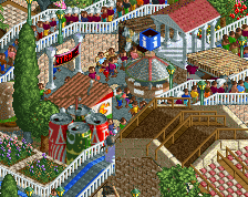
Focus more on facads than the actual structure. As most buildings at theme parks are just fake facads on genaric strucutes. It will help you buidl more interesting, appealing and realistic structures.
Thanks for all the suggestions they really help me! I will spice up my colors and try and make my buildings more realistic (facade)...Also thanks for welcoming me to this wonderful website!
Surprised at the low rating in its current state; I quite like what you've got so far. Sure, it's almost Kumba level brown but the forms a quite nice and there are some nice touches [discoloured walls for the building in the foreground is well done].
However, the content is really close to the map edge, which acts to its detriment. If you take the 'implied more park' route when building things near the edge then it doesn't look good if you cut off a plaza in the middle [which it appears you've done here]. It's better to be clear about where more park content 'might' be rather than just cutting it off.
 08-April 15
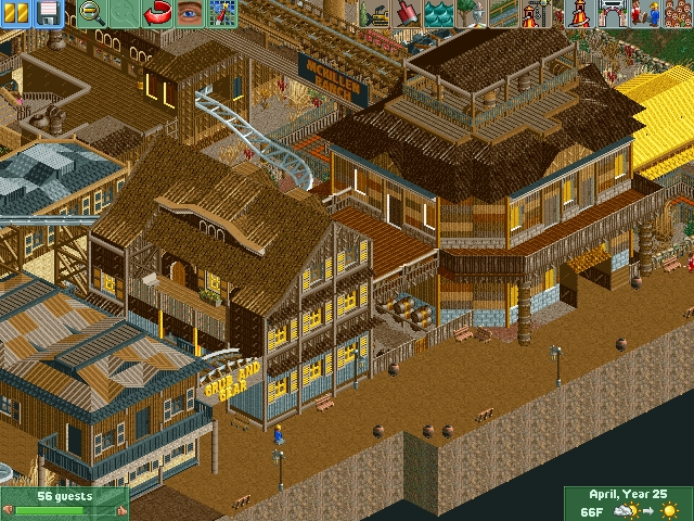
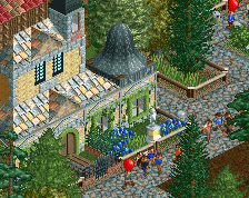
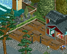
that's not bad at all, just hella messy and hella brown.
Nice to have a new poster. Looks pretty good thus far. Try working in some color to it. Western can have red buildings, some foliage, maybe changing the color of the windows, shades etc.
PRMEshockzzNE Offline
western buildings can be white, gray, peach, tan, brown, red, dull purple, dull light green, etc.. try to make it feel more like a facade than a whole building, as most real western buildings are like that
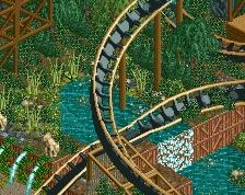
Looks cool.
Where is "brown is a theme" tag?
welcome, good screen
Very cool. You seem to have the western town look down pretty well, but it could use some brighter colors here and there.
PRMEshockzzNE Offline
Surprised at the low rating in its current state; I quite like what you've got so far. Sure, it's almost Kumba level brown but the forms a quite nice and there are some nice touches [discoloured walls for the building in the foreground is well done].
However, the content is really close to the map edge, which acts to its detriment. If you take the 'implied more park' route when building things near the edge then it doesn't look good if you cut off a plaza in the middle [which it appears you've done here]. It's better to be clear about where more park content 'might' be rather than just cutting it off.
looks pretty decent. a bit brown, but its definitely on the right track.
PBJ Offline
Except for the color choices, i really like this. Keep it up!