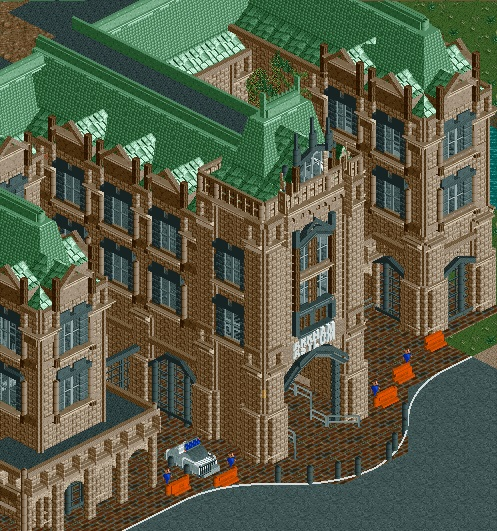
Detailing is spot on as usual, but the scale of the building is what makes this the best thing you've done so far Coups.
Previously I thought your work was very well constructed but so small and unimaginative. This really shows a progression in my opinion... can't wait to see what you are gonna pull out in H2H!
Previously I thought your work was very well constructed but so small and unimaginative. This really shows a progression in my opinion... can't wait to see what you are gonna pull out in H2H!
can't wait to see what you are gonna pull out in H2H!
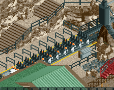
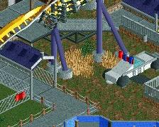
- Too much brick texture. You should improve your textures. - Brown is not a theme. - Black windows are unrealistic. Windows are usually blue in RCT and these look terrible. - Why use two roof textures? - Unfinishedness in the top section of the screen, just eww. - The white line doesn't even match up with the path objects. Seriously? - Too much objects. Overdetailed. - Light brown fence post object. Come on, if you can't see that you clearly have no attention to detail whatsoever. - No police car on the right side. - Barriers are too orange. - One of the policemen is looking at me funny and i hate him. - Not enough pink rocks.
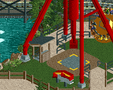
Technically good, but there doesn't seem to be a lot of sense behind it. Why does the building have 3 narrow wings on the front, and why are the police on the inside of the barriers? Arkham should have problems with break-outs, not break-ins.
 03-April 15
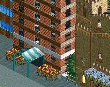
Detailing is spot on as usual, but the scale of the building is what makes this the best thing you've done so far Coups.
Previously I thought your work was very well constructed but so small and unimaginative. This really shows a progression in my opinion... can't wait to see what you are gonna pull out in H2H!
This is great now go finish BLAP.
Let me explain my reasonings.
- Too much brick texture. You should improve your textures.
- Brown is not a theme.
- Black windows are unrealistic. Windows are usually blue in RCT and these look terrible.
- Why use two roof textures?
- Unfinishedness in the top section of the screen, just eww.
- The white line doesn't even match up with the path objects. Seriously?
- Too much objects. Overdetailed.
- Light brown fence post object. Come on, if you can't see that you clearly have no attention to detail whatsoever.
- No police car on the right side.
- Barriers are too orange.
- One of the policemen is looking at me funny and i hate him.
- Not enough pink rocks.
(i'll change my vote to 100 soon)
corrected
Technically good, but there doesn't seem to be a lot of sense behind it. Why does the building have 3 narrow wings on the front, and why are the police on the inside of the barriers? Arkham should have problems with break-outs, not break-ins.
I agree that textures are too boring for this big a building, try mixing stuff up...
I think this is really nice, but I'd much rather you finish Baker Lake, it needs to be done now.
i like this guy.