Screenshot / New Hersheypark entrance
-
 28-March 15
-
 Hersheypark
-

 3 of 9
- Views 3,626
- Fans 0
- Comments 12
-
 Description
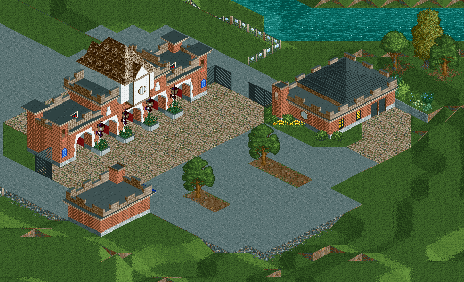
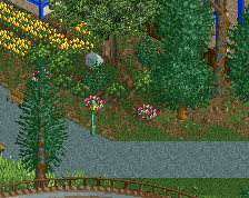
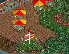
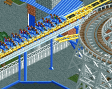
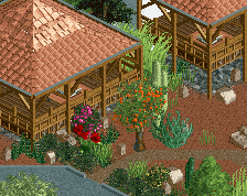
Started the map from scratch for the third (fourth?) time. Old map got glitchy but helped to lay out the park correctly. This hopefully should be the final redo and allow me to add a bit of charm that wasn't exactly there in the first few rounds of just modelling it as realistic as possible from Google Earth.
-
 Full-Size
-
 No fans of this screenshot
-
 Tags
Tags
OMG will you ever finish this?
If you need any help with any of the coaster layouts, just give me a shout!
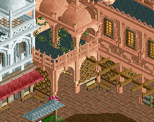
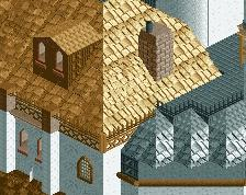
Looks really nice! With some benches and lights, it will be very pretty. Not a big fan of the roof texture on the main buidling though, but it serves.
@Louis - I've actually snagged Otsdarva for the coasters/insane hacking, he's got some really cool things that I haven't seen anybody do on NE that will be in this park. And it'll be finished. Hersheypark wasn't built in two years, you know.
@Jappy - you have any suggestions on a different roof texture? I think this one is fairly accurate to what is there, and the whole main street of Hersheypark has the steep rooves/tudor style
Maybe the pirate rooves? I'd say, try it out and then see what looks best. For the rest, it is still very accurate though, nice job!
Wow! This is amazing! Really love your style, hope you can finish this.
Scale's a little small, but it works. I think a smaller scale could help fit everything in.
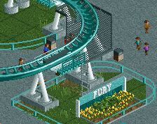
For the record: I was already building a Fahrenheit-inspired Coaster before I saw tht. That being said, I would love to see a recreation.
@Version1 - I think I finished my Fahrenheit recreation about a year ago... there's a download of the park in the comments on reddit if you want to see it.
@itm - Yeah, the smaller scale is needed. I actually doubled the size of the entrance building from my third map to make it look more impressive for RCT, but otherwise, the park barely fits on the largest map size with everything built roughly to a 2m/edge scale.
@thirteen - I'm conflicted on them too. They are basically the exact lamps on the real entrance, but if they detract too much/should be smaller, I wouldn't be opposed to removing them.
Nice recreation!
Same lamps, but they still look out of place...I'd consider importing Kumba's small 1k lamp object [probably from SoK] as I think the scale is a bit better.
I also think that this would be better if you used a railing fence instead of the solid walls around the bushes. Also not quite convinced by the crazy paving path...I think maybe off-white or perhaps even a lighter tarmac would work better.
Not a bad start though.
that looks really good! Its a bit squat though. I'd consider some height. that said, I haven't actually been there so you could have done a great job.