Screenshot / Soak City
-
 24-March 15
-
 Magnum XL-200
-

 9 of 12
- Views 1,711
- Fans 1
- Comments 5
-
 Description
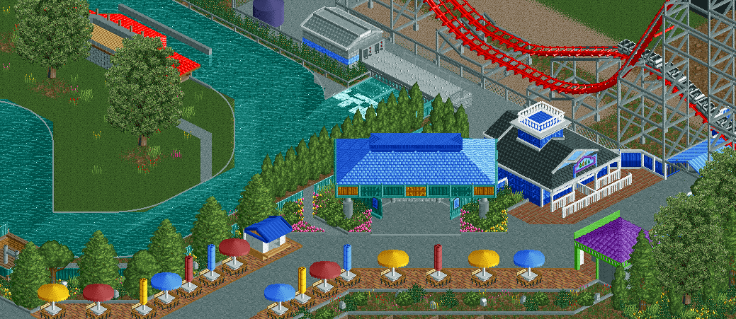
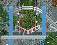
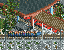
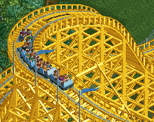
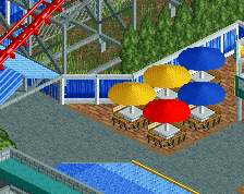
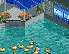
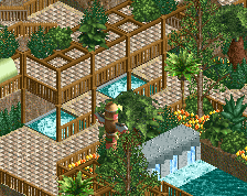
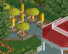
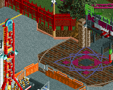
Finally got around to finishing/working on this area after much procrastination. I think it turned out pretty well despite the bathroom being slightly too tall. I really had limited space for the entire Soak City area so some of it isn't super accurate, but hopefully it doesn't become much of an issue.
Due to my progress and underestimation of the amount of work left to do, I am now aiming for a mid/early May submission so I can do some more hacks on my Windows 7 desktop which I wont have access too until May. I probably will re-do some of the other areas of the design as well, just to update them to my currently ability. The unfinished area in the top is well, unfinished, not much will go there except for another generic ugly green/blue building and some storage areas.
Anyways, hope you enjoy. -
 Full-Size
-
1 fan
 Fans of this screenshot
-
 Tags
Tags
I like that, its coming together more in that screen for sure.
except make that fancy railing on the top of blue building grey and grey, because the white palette is always just too bright for some reason on that fence
I'm curious to see how you pull this off. Soak City is just the shittiest, most dated water park ever so I'm interested to see how you make it look good in RCT.
actually reminds me a hell of a lot of CP6. get the foliage dialed in and holy shit i'll be more than impressed.
Man, I guess I never noticed those two buildings there during the stream last night, but damn they look pretty great! This project is really coming along G, and I can't wait to see it finished.
I'm really interested in this park. I think nedesigns is going down the path of recreation in a manner of what they'd rather the park looked like, or the impression they get when they visit, whereas in reality a lot of theme parks would actually be relatively sparse or appear under-detailed when viewed from a top-down isometric perspective. The use of ground level sight lines makes parks from a patron's view often look more integrated and coherent, but in reality many parks are indeed large swathes of path and rather utilitarian structures, as necessity of footfall dictates.
I realise that was rather rambling, so I'll summarise; I like how this park is progressing as a recreation/real-life inspired park. I think it's taken a careful eye and a neutral point of view to truly attain this level of accuracy.
My one tiny criticism of your screenshot is that surely the backstage area access path to the left of the entrance building should be gated at the fence? I wouldn't know for certain, but I'm sure it wouldn't be left open to careless or lost guests?