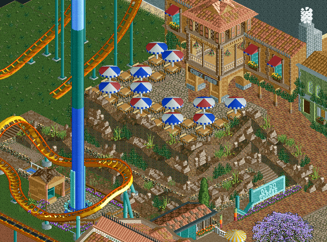
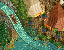
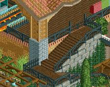
Screenshot / Le vol du Gorge
-
 05-March 15
-
Fred's Ultimate Coaster Kingdom
-
12 of 36
- Views 2,749
- Fans 0
- Comments 11
Community Forum Software by IP.Board
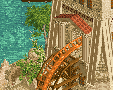
Started with this:
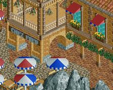
Much better man! Genuinely a good screen and the landscaping makes a lot more sense!
Edit: I don't like the umbrella colouring, doesn't make sense.
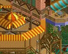
The umbrella's are colored like the flag of France, so I do think they make sense I thought it'd be a funny detail.
It's not the fact that you used red, white and blue for the umbrellas, but the way you used those colours. Why don't the fringes underneath match the colour of the umbrella above? Now I'll stop nitpicking .
.
PBJ Offline
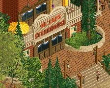
much better man!
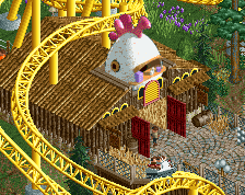
I love to work with 1/4 bb ground blocks for landscaping
yes yes much better!
there you go. right track for sure.
10x better
Agree with everyone.
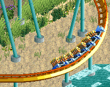
The custom 'V' looks a little odd though, I think it would just look better if you got rid of it and just used the normal sign. It's not a ride sign so it isn't required in my opinion.
PBJ Offline
Thats not a V it's a M from mistral...