Screenshot / Watchtower
-
 01-March 15
-
 Landgoed de Graaf
-

 6 of 9
- Views 1,545
- Fans 0
- Comments 5
-
 Description
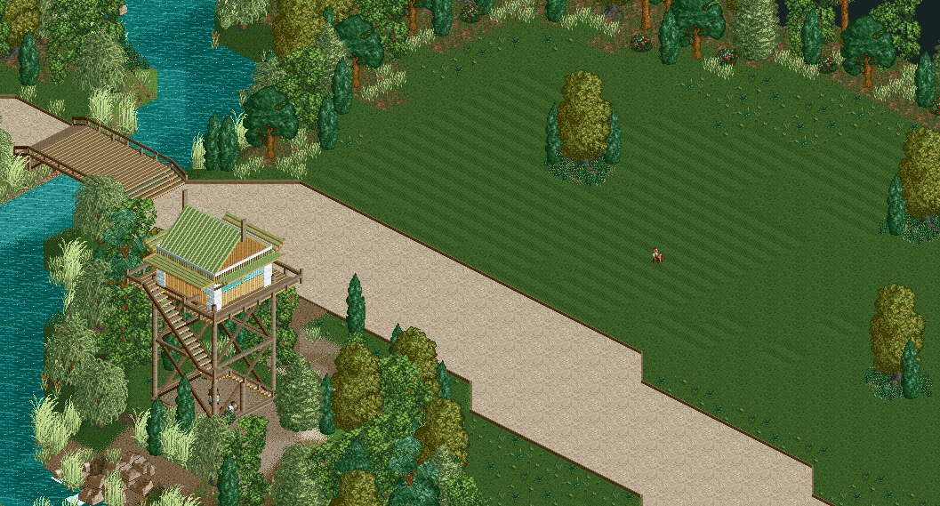
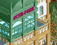
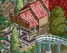
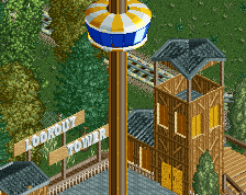
I made a little watchtower with a little open space. I am really practicing fiolage and i want some feedback for it. I really like to build in a calming way, just like the 50s.
Also tried to put a little more color in it. :P
Inspiration picture for the tower: http://www.firelookout.com/id/bumblebee1950.jpg -
 Full-Size
-
 No fans of this screenshot
-
 Tags
Tags
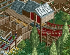
@Liampie: Wich trees do you mean? I thought I just picked the default colors.
What what what, supppppper nice. The use of empty space is amazingly nice, works so well.
The watchtower is very well done to! I love how it looks like the blinds can fold down to cover the windows. The details are good.
You're building at a huge scale, wide paths, big tower, big open areas. And it looks really nice.
Foliage isnt bad. The way you've clumped the low foliage above left of the handyman looks the best. You need to do that elsewhere IMO.
Colors are a bit strange to, maybe more standard stuff and variation among the grasses.
Looks like trees you'd make
Looks really good Rolf! Your style is pretty clean and realistic.
Love the tower.