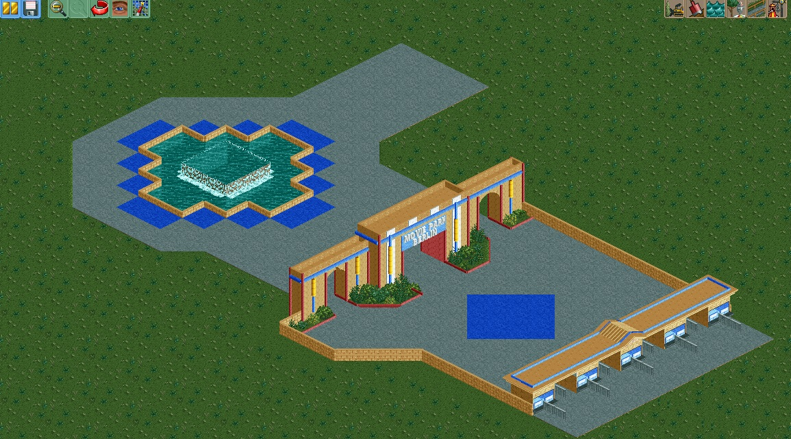
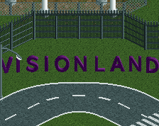
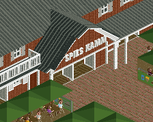
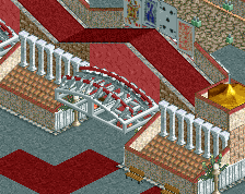
Screenshot / Movie Park Entrance
-
 28-February 15
-
 Movie Park Berlin (Abandoned)
-
 1 of 2
- Views 3,459
- Fans 0
- Comments 11
-
 Description
I started my first cso park project, because I'm currently reading a book about Uinversal Florida and I think I can do good work with this. The Wooden coaster and its station are saved for other projects, it just didn't felt right to do a design out of it because the layout wasn't really suitable for it.
-
 Full-Size
-
 No fans of this screenshot
-
 Tags
Tags
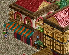
Too much brown, use more pink instead!
scale is off, but a ton better than what you're doing in ncso honestly.
BigB Offline
high gates = good
low gates = out of scale
you make a good improvement , but this thing is a bit too small. put it up with bigger gates. and hopefully you don`t let the walls stand up.
soo its a good picture from YOU , go on
I agree, the low gate needs to be taller, maybe just one unit or so, maybe look at the entrance of Disney's Hollywood Studios or a park like that.
Colorado-Fan Offline
It looks too small and there should be more details. This is the entrance area of a movie park. Change the scale and work on your details. Otherwise nice to see you working on NCSO!
Version1, stop depending on the community. Do your thing in RCT. The rest follows.
People like high gates because that's what real parks do. Also, it looks better.
Also this:
Although I'd add "as much" in that your work has improved a lot since starting CSO but posting one or two screens from a project and then cancelling it doesn't really help you improve [finishing, develop park layouts etc] or allow the community to provide feedback [we don't have context].I know, Stoksy, but my last projects just didn't work the way I intended them to. Zhis will, because it's simple and nothing too special.
Wait to post until you have a little more. It's a nice start, but I think some elevation change is needed, and I agree with the statements on color.
Yeah I think the scale is really not right. the ticket booths are really low and the arch is tiny. should at least be as tall as long on each arch bit, if not more.