Screenshot / Kukulkan
-
 26-February 15
-
 Huracan
-

 3 of 5
- Views 2,762
- Fans 1
- Comments 10
-
 Description
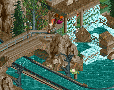
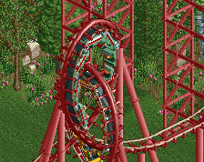
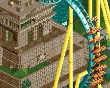
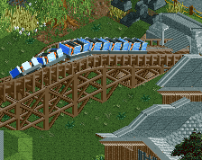
"In one tale, Kukulkan is a boy who was born as a snake. As he grew older it became obvious that he was the plumed serpent and his sister care for him in a cave. He grew to such a size that his sister was unable to continue feeding him, so he flew out of his cave and into the sea, causing an earthquake. To let his sister know that he is still alive, Kukulkan causes earth tremors every year"
-
 Full-Size
-
1 fan
 Fans of this screenshot
-
 Tags
Tags
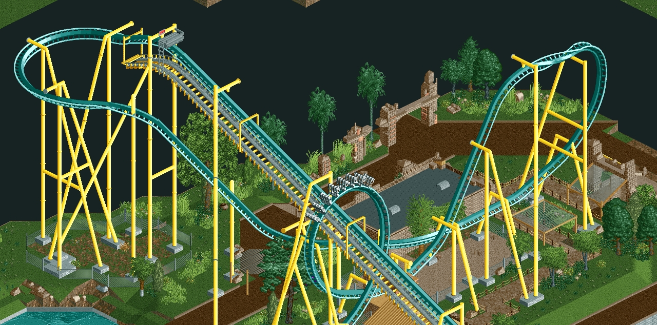
Now that is a much better screen!
6ca Offline
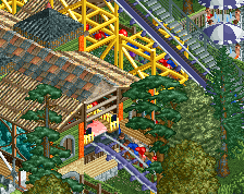
Hulkpower...not the most tactful. Great screen, but it might be nice to add say, a track-colored small footer underneath the supports so that the track actually looks attached to the support.
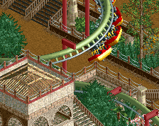
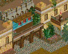
Loving the broken brick arches there. First drop reminds me of Fenrir if it was invert! So, clearly, I approve.
What's Fenrir?
Rob: http://www.nedesigns...ark/749/fenrir/
What nin said. Other than that bold colour choice which I'm not quite sure works yet, but may work better with denser surrounding foliage.
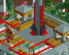
Nice and clean. Good theming. I just can never get around the diagonal paths. They make everything look so forced - like a control freak building.
nice work! I'd love it if the foliage was a bit more lush and tropical though.