Screenshot / The Gate
-
 24-February 15
-
 Landgoed de Graaf
-

 4 of 9
- Views 1,816
- Fans 0
- Comments 5
-
 Description
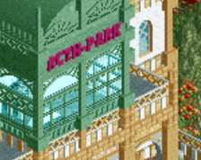
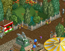
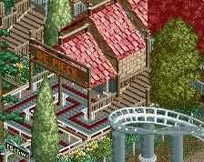
I tried to make the gate to Estate "De Graaf" and I am pretty proud of it, but I still think it is somewhat to brown. Any ideas how to put more colors in this screen?
Also some parking space in the screen.
EDIT: Got a flag in front of my name, yeah! :3 -
 Full-Size
-
 No fans of this screenshot
-
 Tags
Tags
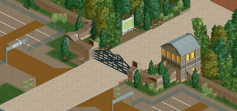
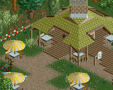
Hmm. Perhaps you could add a grey deco-trim on the wall, like on the small building on the right.
@Jappy: I tried it but it looks a little to busy. I want it to look rustic and calm.
@G Force: How do you mean lots of tan?
I love the gate but there's not much else here to comment on.
Well, maybe try coloring the top of the wall in a different colour. One thing you should definitely do is add some lamps and benches