Screenshot / Little Winny
-
 24-February 15
-
 Avonturenpark Vossendal
-

 2 of 18
- Views 1,885
- Fans 0
- Comments 10
-
 Description
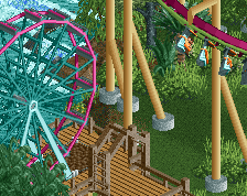
Personally, I'm very happy with how the coaster station turned out. I'm not so sure about the entrance to the ferris wheel. Hacking isn't really my specialty so theming has to disguise the entrance huts. What do you guys think? How could I improve this zone?
-
 Full-Size
-
 No fans of this screenshot
-
 Tags
Tags
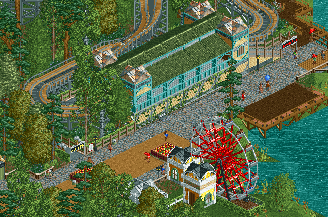
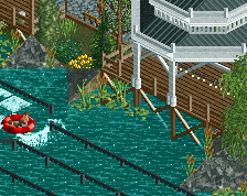
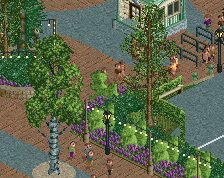
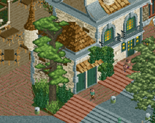
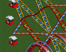
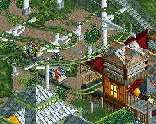
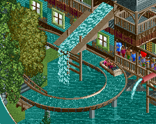
Your station feels very crushed, it's very short with a low roof. Perhaps raising the roof a unit or two.
I also think your roof choices could be better, the green wood is not that good looking, and the pirate style rooves are kinda outlandish.
It looks good though, keep it up.
Agreed - I see nothing wrong with a station this size. And with a name like Little Winny, it fits perfectly. There's a lovely lushness to this screen, and I think the way you're covering the ride huts is fine too.
I like this but the buildings are really small compared to the very high fences.
it feels very atmospheric but i feel that if you tweaked this a little, make the station a little more open (no so much larger, per se), and reconsider some of the color choices to maintain cohesion with park elements whilst at the same time keep it interesting, and you'd have a screen that would impress, something close to what liam or steve might do as a less serious project.
EDIT: also the tan path in the middle, and the seating area can be better executed, and either some awnings or thicker/bigger trees here and there.
Well, I have taken all your critcism into account, and made a few changes, while also keeping the stuff that I like. Sorry Austin, I like those pirate rooves too much, and I'm working with quite an old bench so... How's this?
Green roofs were better, I'd say.
I actually disagree. The brown stands out more against the foliage but I do think if you have supporting buildings nearby, the light green or perhaps a soft purple would look great to give the area more color. Also too many path types.
I would use the boardwalk path type for any overhang areas, I also would use a different bench type, the basic one would probably be just fine.