Screenshot / Avalanche Station
-
 23-February 15
-
 The Forces of Nature
-

 5 of 14
- Views 2,015
- Fans 0
- Comments 18
-
 Description
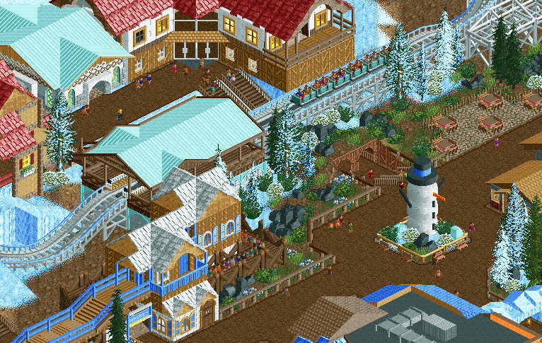
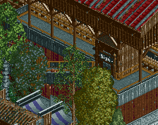
I've been working on the "Forces of Winter" section of the park. I rebuilt this station a few times, then I started adding in the surrounding buildings, foliage, fences etc. The screen isn't 100% complete yet. Still need to get some eyes on that snowman!
-
 Full-Size
-
 No fans of this screenshot
-
 Tags
Tags
i'll comment on this later, but are flags back?
edit: love the snowman. the rest is cool too
That snowman is cute as hell. Nice screen.
Why you don't give eyes to snowman!
gdb - what flags are you talking about?
rcter2 - I'm a little tight on scenery objects already, still trying to figure out what object I'll use for the eyes.
or am i just way too late to notice this
first time it showed up for me on the site, I'm no longer undercover
what's even weirder is that it has disappeared for some
mine is showing flags for some people. was that not always the case? I was pretty sure the flags were always around... thats how I knew stoksy was australian immediately.
its a pretty nice screen. but I don't like the black rocks just strewn around randomly. You got to balance the aesthetics. but overall, good work, a winter theme is tricky
Ofcourse everyone could already get that i'm Dutch from my name, but now it looks 129482349174x better!
This is cute as hell
Very atmospheric! I like especially the Queue-Placement a bit on top of the Mainstreet and of course the Snowman \o/
I love this.
I've seen enough snow for one season, not my cup of tea.
I was going to use some support structure end caps for the snowman's eyes, but I switched out the objects. Perhaps I'll try liam's suggestion, or use some other object. Glad to see/hear a positive consensus, I should be popping out some more screens shortly. I have bits and pieces done in different areas, but not quite enough to show complete screens
you have some really nice forms going on here in the architecture and an interesting queue placement. what you're lacking in is refinement, the execution of it all. most of it is just inconsistencies, however; the building with the diag entrance is great but the ones adjacent to it aren't. same with the queue building. path could also be better done than this. your foliage is too sparse, too, and if you added more and give it a lusher feel while still having the identity of winter, this screen would look 100% better.