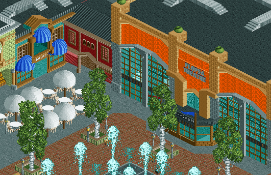
Screenshot / Plopsa theatre
-
 02-October 13
-
 Plopsa Brittanica
-

 16 of 19
- Views 2,294
- Fans 3
- Comments 4
-
 Description
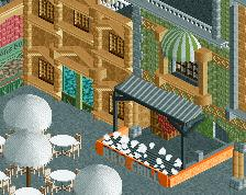
The Grand Theatre is for the big things: a presentation or speech to a large group of guests, an exclusive live show with your own performer, or with Plopsa’s Studio 100 characters... Everything is possible, so long as it is big, grandiose and wonderful.
-
 Full-Size
-
3 fans
 Fans of this screenshot
-
 Tags
Tags


i quite like that. it makes the orange look elegant.
I'm not a fan of the theatre's colours, and surprisingly it's not because of the orange, but of the tan+grey combo that doesn't really work in my opinion. But it's still a good screen. Voted 75%
Turning the tan into gray wouldn't be a good solution, I'll see if there are other color combinations that work instead of the tan