Screenshot / Wasteland - Port
-
 22-February 15
-
 Wasteland
-

 24 of 31
- Views 3,224
- Fans 2
- Comments 22
-
 Description
Westport's gotta have a port right?
So I originally had a tiny ass crane and 1/4 tile cargo containers. But, my artistic vision (yeah I'm gonna cite that now) aimed for really massive and overdrawn scale in the Westport city, and I think this does a way better job of that. The cranes being so close makes their structures look a tad chaotic, but I think overall it suits a good direction and purpose. It looks much better next to the huge buildings in Westport. Very pleased with how it turned out. -
 Full-Size
-
2 fans
 Fans of this screenshot
-
 Tags
Tags
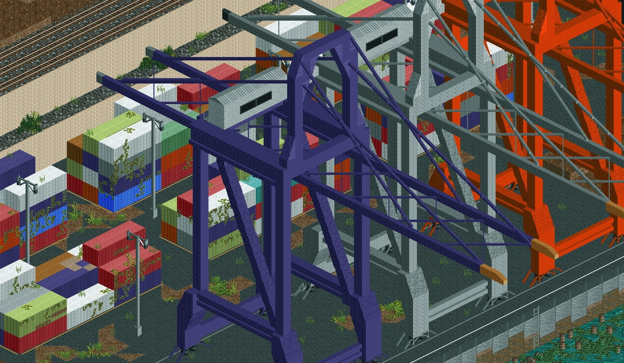

Hmmm, I'm afraid I'm not feeling this as much as other people seem to be. Everything looks kind of basic to me, with a lot of repetition. Naturally, organised ports would be as such, but I feel there's opportunity for you to add much more to this: rust and damage on the cranes, some knocked over containers with contents spilled (and just something to add diversity to them, rather than them all being mono-textured and made of two pieces), and something more to suggest decay other than vines and alternate coloured path. What you've made is certainly impressive, but I feel it's not at the same level, creatively and aesthetically, as your other screens.
Are any of those cranes abandon, I would imaging any metal structure abandon for a decent period of time wouldn't have bring paint.