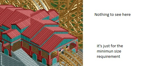
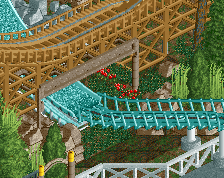
Screenshot / A station
-
 19-February 15
-
 GCI Project (Abandoned)
-
 1 of 2
- Views 1,541
- Fans 0
- Comments 6
-
 Description
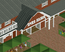
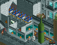
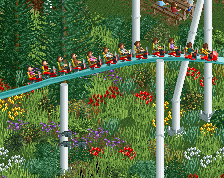
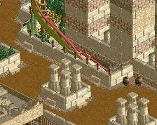
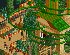
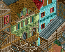
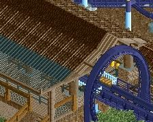
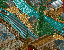
I didn't really want to show you guys screens of my current project, mainly because it will need loads of refinement, but as I have signed up for H2H for whatever reason (still hope there will be enough skilled players soo that nobody has to draft me) I thought it would be best to share it either way to show you guys what you are into if you (have to) pick me.
-
 Full-Size
-
 No fans of this screenshot
-
 Tags
Tags
You're really improving. I hope you get drafted because working with some other people might really help you improve even more. At the rate you're going to be a VERY good player in the not so distant future.
As I told you on skype, I really like the station.
Nothing too spectacular, but nice structure and the colors are working well together.
Overall a huge improvement!
I think your biggest problem is your impatience. If something is not going exactly as planned, you tend to throw it all away instead of trying to make it happen. Also I would recommend you, to focus more on cso work, because it seems to suit you better than ncso.
BigB Offline
Finally you've got something to work on- Time for details
Have a look at the stairs .... grey, nothing else, just grey. Try something to make it les ... grey.
Or those archers/columns/open windows, they fit but its 20x the same motive. Change something. Try harder
I like this a lot. It is simple, but charming at the same time.
dat Microsoft Office Skills.
I really Improve , I like it , As Mci sad nothing special but you will be better and better.
I like it, but a bit more details would improve this a lot. Maybe you should add some railings or fences.