Screenshot / Plaza
-
 17-February 15
-
 B&M Invert - Extinction
-

 6 of 9
- Views 4,143
- Fans 1
- Comments 29
-
 Description
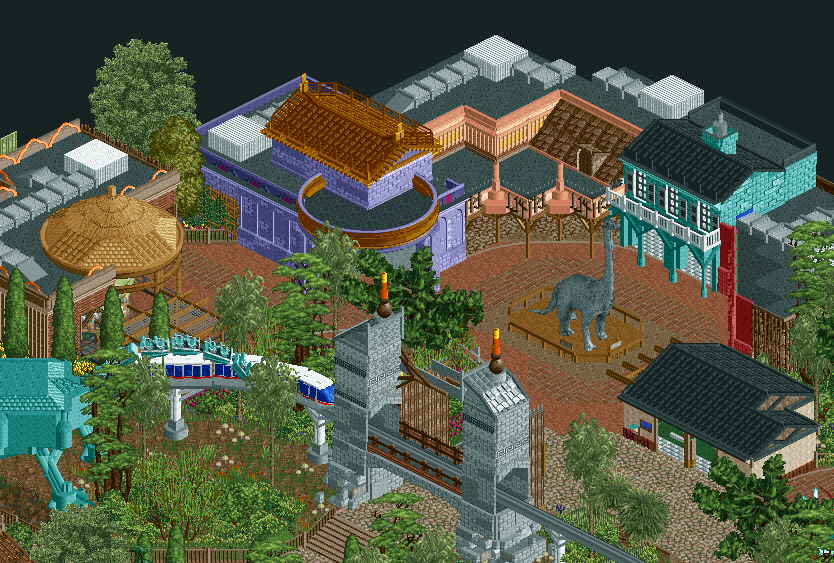
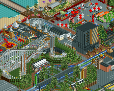
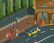
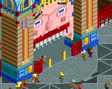
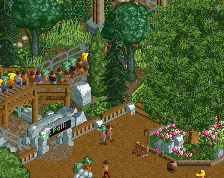
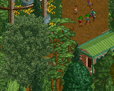
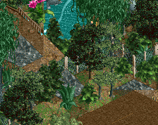
Just outside the official entrance into Jurassic Park. The purple building is a bit meh and I have no real idea what's going on with the roof of the peach building. But it's progress...
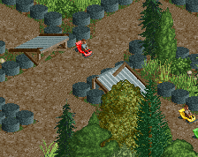
I tried my hand at creating a custom dinosaur, with some inspiration from what nin did in his JP screen. I'm not really sure how well it turned out...something just seems off. Anyways, this is progressing at an acceptable pace although I haven't actually done much/any theming on the coaster itself...umm. -
 Full-Size
-
1 fan
 Fans of this screenshot
-
 Tags
Tags
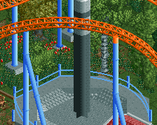
The blockiness of the dinosaur was the main issue I had with it, although it's interesting to see the contrasting comments about the neck and head. Was just thinking after posting that maybe ride track for the body might help a little [already using it for the tail], so I will definitely try that Fk.
@navalin: It's more of a statue than an actual dinosaur, so the skeleton-style neck and head make a little more sense I think.
I can certainly understand the comments about a lack of cohesion, I struggled primarily with making the diagonal facades look any good without getting too repetitive and it got a little out of hand unfortunately. I'm thinking that I'll end up redoing the purple building into a similar style to the carousel roof which will also help with connecting the peach building a little better. I really like how the teal building turned out but can certainly see how it sticks out.
@Shotguns: Brachiosaurus was a strong source of inspiration here, and I was using it as a means of finding more colour combinations to use other than brown. Hopefully the changing in colour of the purple and teal building will help with cohesion.
@Tim: Great call about the monorail trains! Will change that immediately.
Thanks everyone!
If anyone can hunt it down, Stoksy, you should have a look at the unfinished Jurassic Park H2H park egg_head and I made. I think it was H2H5. We made some pretty cool custom dinosaurs.
Anyway, I agree with all the previous critiques. Looking good!
^Anything that could help would be much appreciated! Although, I'm not really sure how I'll be able to find it if it isn't in the database...maybe if someone has it they could send it to me?
Ah, yeah, that one would take some hunting down. Wish I still had it, would like to see it again. Anyone?
Kumba might still have it. Otherwise, maybe egg_head does. :/
I did some digging on the old H2H forums and could only find an overview screen, all the other download links are dead, sorry y'all.
http://i2.photobucke...H/lostworld.jpg
Edit: wow, that looka glorious. You, egg and Levis (image host)?
Damn that looks good...hopefully someone has a copy.
I think each building is a totally separate entity and I think that looks weird. I think you need something to connect each one visually, perhaps like using a thatch roof or something, the colours make each one different enough, so you need something that ties them all together thematically.
Also, the roof for the purple one, the circular roof seems very forced, I'd remove that. Love the neck of the dinosaur and the gate looks very nice.
All in all, very solid, but could be so much better with a few little changes here and there.