Screenshot / Plaza
-
 17-February 15
-
 B&M Invert - Extinction
-

 6 of 9
- Views 4,153
- Fans 1
- Comments 29
-
 Description
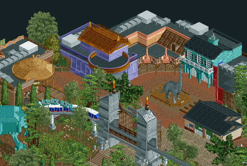
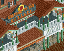
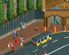
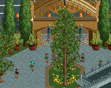
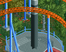
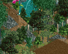
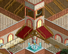
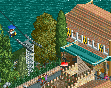
Just outside the official entrance into Jurassic Park. The purple building is a bit meh and I have no real idea what's going on with the roof of the peach building. But it's progress...
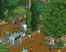
I tried my hand at creating a custom dinosaur, with some inspiration from what nin did in his JP screen. I'm not really sure how well it turned out...something just seems off. Anyways, this is progressing at an acceptable pace although I haven't actually done much/any theming on the coaster itself...umm. -
 Full-Size
-
1 fan
 Fans of this screenshot
-
 Tags
Tags
Maybe you should just try making the dinosaur with coaster track rather than coaster trains. A monorail or an inverted track could work.
is this a design or park m8
looking really good, loving the feel
I guess in roller coaster tycoon, gamers uh, find a way
PBJ Offline
great screen!
I agree with Wouter on the neck part. Monorail can't go that steep down. maybe invert coaster or swing coaster track?
Also I'm not a huge fan of the tin wall in the grey gate. (where the monotrain is passing trough)
other then that great screen!
i think the coaster train is a really cool idea. i say keep it. looking really awesome
I like the track as the neck/tail personally, I think its a nice unique touch and looks quite authentic and sort of scale like as dinosaurs had. Good effort, rest of the screen is good too.
I think the coaster neck makes sense if it was a skeleton, not a living dinosaur. So cool idea, but wrong application. The rest is lovely.
Archy looks great, amazing atmosphere. That pink building has some crazy illustrations to it, which i love, though may not make sense here. The pink poles on the front awning connect to the back roof, making them look like supports.
The coaster neck is fun, i think it works. My main problem is how boxy the main body looks. Difficult to tell without seeing in game, but i would work on making that more smooth and organic, maybe with some ride track.
That peach buiding messes with my mind.
Great screen otherwise. My only suggestion is to give your buildings more purpose. Perhaps a couple signs or racks outside saying what they are.
Awesome chubby dinosaur.
awesome dinosaur statue. pretty close to robbie's work (not really copied though) both in style and almost in quality too
i feel the same way liam does, and to note i'm not feeling the atmosphere as intensely as some are suggesting through their comments or in similar releases to this (e.g. brachiosaurus by fr3ak)
speaking of that design, something it did right that i think you can apply to this park is indeed cohesion. it'll allow people to appreciate the area rather than just each structure one-by-one
details like that dinosaur are fucking killer though
Might I also suggest either of the open-air monorail cars? I think they'd fit with the theme a lot more.
the retro ones, specifically. nice job on the monorail supports, stos
^That's a good idea, listen to itm.
I like the coaster train for the neck. It's really creative and unique. I do agree though that the body is a little boxy so try to improve that somehow.
there isn't like a clear architectural style, but I don't really care, because dinosaur doesn't imply one sort of architecture. its just a sort of tropical mish-mash and IMO it actually works.